

Roswell Biotech
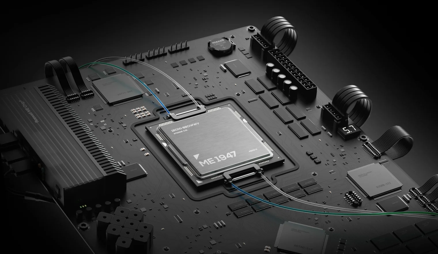
Bringing a new age of biotechnology: Roswell’s revolutionary ME biochip is the future of solid state molecular biology.
Project Overview
Paul Mola and Barry Merriman founded Roswell Biotechnologies in 2014. As veterans of genomic sequencing, they understood that precision medicine would fail to live up to its promise without a new technology to carry it over the threshold of its diagnostic limitations.
As Roswell Biotech, they created a computational architecture that not only incorporates the precision of biology through its direct application (no machine learning approximations and “AI” simulations), but one that also utilizes the immense potential of being easily scalable and applicable to existing software and digital technologies.
It’s a true microchip, but it’s also a gateway of discovery that leads into a new understanding of biology.
Just like Intel’s 4004 microchip brought us digitized information back in 1971, the Roswell ME Chip™ is the first to cross the frontier of digital biology, bringing us into a new age of biotechnology and revolutionizing health.
Learn more about Roswell’s technology from the Roswell team, including their CEO, Paul Mola himself, in the video below.
02:26
Play
Challenge
Roswell Biotechnologies developed a truly new technology; deep tech in its most literal form, molecular electronics on a chip with serious ramifications across major industries. But, it was difficult to comprehend.
Our job was to capture its technical prowess in a completely unique visual narrative. We had to tell the story of the chip’s ingenuity in a way that reflects the reality of its technical specifications, while covering the vast expanse of its potential application.
The brand needed to embody the spirit of innovation behind their technology. However, it was crucial for Roswell to stand out as a company that delivers on the promises of progress, a claim too often casually tossed around in their industry.
The challenge was serious, and so were the founders of Roswell.
We seriously loved it.
Approach
During our initial discussions on scope and approach, the founders of Roswell immediately made themselves very clear: they wanted “the Rolls Royce of websites,” complete with a suite of premium visual assets and a full rebrand.
Our approach was centered around expressing Roswell’s credibility through a visual narrative that moves away from the tropes of tech startups; staying far away from vague statements, oversimplified or overcrowded charts, generic visuals, and text-heavy layouts bordering on technobabble.
We were determined to present their technology and values through a comprehensive, easy to follow, storyline that grips the audience with the gravity of Roswell’s technological achievement. This way, the user would be immersed into a visually eloquent storytelling experience, one that faithfully represents the reality of Roswell’s character, values, and technology. No oversimplification, and no information overload.
Roswell placed their trust in our ability and direction, and with our objectives set, we were ready to begin what turned out to be a fantastic project and a true partnership.
Objective
- ①
Brand
Rebrand Roswell Biotech as the leading molecular electronics company that’s pioneering a new age of biotechnology, and transforming health. Express their character, accentuating the sophistication and impact of their technology, while retaining core legacy elements.
- ②
Assets
Create a full suite of new visual assets (static, animated, interactive, 3D, and 2D) that drive and/or support the visual and technical narrative. Focus on the technology, faithfully representing its technical elegance and functionality, while maintaining a clean aesthetic.
- ③
Website
Build a website around the story of Roswell’s technology and its implications for health and the biotech industry. Craft a balanced visual and educational experience through immersive storytelling. Assure it gradually covers all key aspects of the technology, highlighting the company’s values along the way.
Branding
- Logo design
- Color palette
- Typography
- System
- Applications
- Social media
From rebrand to Roswell Blue: making a brand identity that brings to life the character of the molecular microchip.
Challenge
Roswell came to us with their existing brand assets, initially suggesting that we only do a brand re-fresh. However, shortly after reviewing our proposal, they agreed that a complete rebrand was in order.
Their old brand simply wasn’t built on a foundation strong enough to elevate them to the next level, which is where Roswell needed to be.
That existing foundation was our main challenge: Roswell already had a recognizable image, and we had to keep that association while moving in a completely new direction.
In other words, we needed to forge a new visual identity that can carry Roswell through the next stages of their development, while keeping the appearance that we’re using the same mould.
01:30
Play
Direction
The direction we set for Roswell’s new identity pointed us to a minimalist design that can adapt to the vast variety of their future products, while retaining their core values through its visual character.
As such, the new brand needed to carry a certain tone of authority that’s associated with hard science and cutting-edge technology. But it also needed to resonate with the softer, compassionate voice of biology that their technology is rooted in, as associated with nature and health.
Our approach, therefore, centered around forming an elegant, timeless aesthetic that unifies these qualities and forms a brand that keeps pace with Roswell’s technology.
Result
As we were bound by the familiarity of the old brand, we secured its legacy by keeping its core elements: the DNA helix structure, and the old logo symbol’s “R” shape. We then moved on to completely transform the logotype by introducing a perfect balance of symbol and typography.
Apart from the new logo, most of the brand’s visual expression is carried by the typography and the color palette, while the brand’s dynamic language system provides consistency of expression across mediums.
As a whole, Roswell’s new identity is that of a modern biotech company, nested in the elegant visual narrative of biology and health with slightly futuristic accents denoting the potential of their leading technology.

The LOGO, COLOR palette and typography: the elements of innovation, in style
Shaped to signify the letter “R” (as in “Roswell”), the logo symbol incorporates a stylized DNA helix formed in a hexagonal grid with slight adjustment to the spacing of individual sections.
The full lockup adds the logotype, a customized version of the timeless classic Helvetica Now Display, that elegantly communicates the company name “Roswell”, keeping the perfect balance of elements with intentional use of the lowercase “r”.
However, the logo only complements the brand’s new color palette and typography, which are the core of the visual narrative.
Colors like Roswell Blue and Orange are the strong accent colors used on smaller surfaces, calling attention to detail, key words and phrases, or evoking a sense of modern elegance. They can also serve to provide balance to the Roswell Blue Gradient, as it depicts a transition in technology and needs their strong contrast to form its focal point.
The softer, gray color tones are used as backgrounds on larger surfaces, letting the main font (Helvetica Now Display) seamlessly carry the brand’s message of innovation across all mediums. This flow is interrupted only by the IBM Plex Mono typeface that communicates technical information and adds to the scientific aspect of the brand’s character.
When brought together, all these elements compose a cohesive, modern form of visual expression that pays homage to Roswell’s legacy and speaks to the sophistication of their product with a voice of clarity and style.
dynamics of digital design: roswell’s branding system
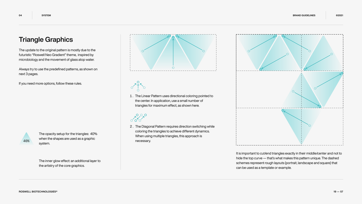
Once we’ve established Roswell’s brand character in the form of the logo symbol, colors, and typography, we needed to ensure that it carries seamlessly across and throughout all branding applications.
In order to allow for this versatility, we needed to establish a set of guidelines. These rules ensure a consistent tone for visual communication in both digital and print formats and aid in creating a stable visual style that is easily distinguishable as one unique to Roswell Biotechnologies.
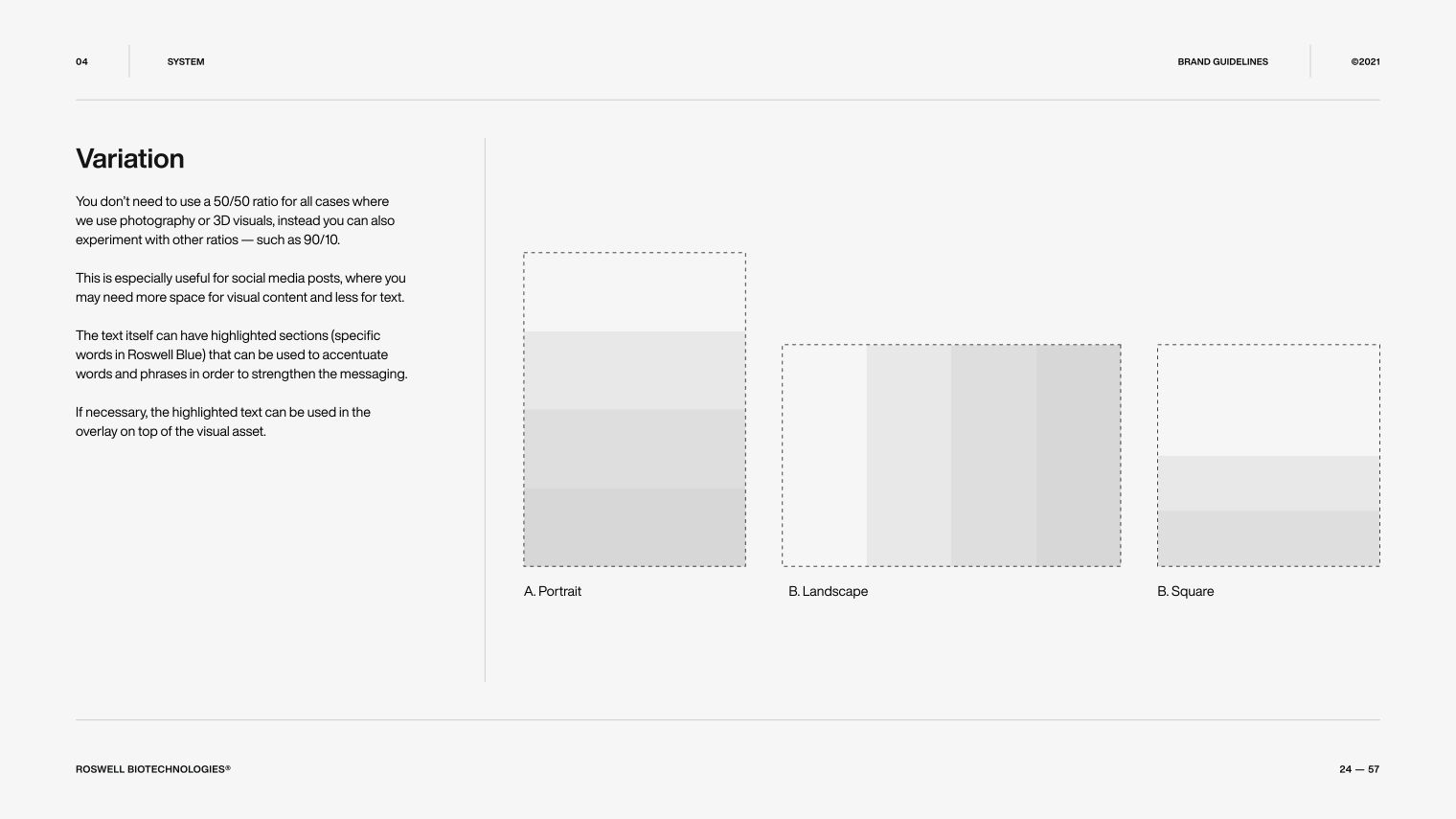
These guidelines, in their refined form, come together in what we call “Roswell’s Dynamic Brand Language System,” as shown in the excerpts from the Brand Guidelines below.
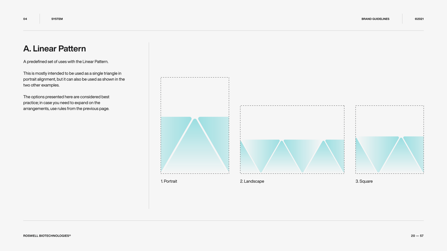
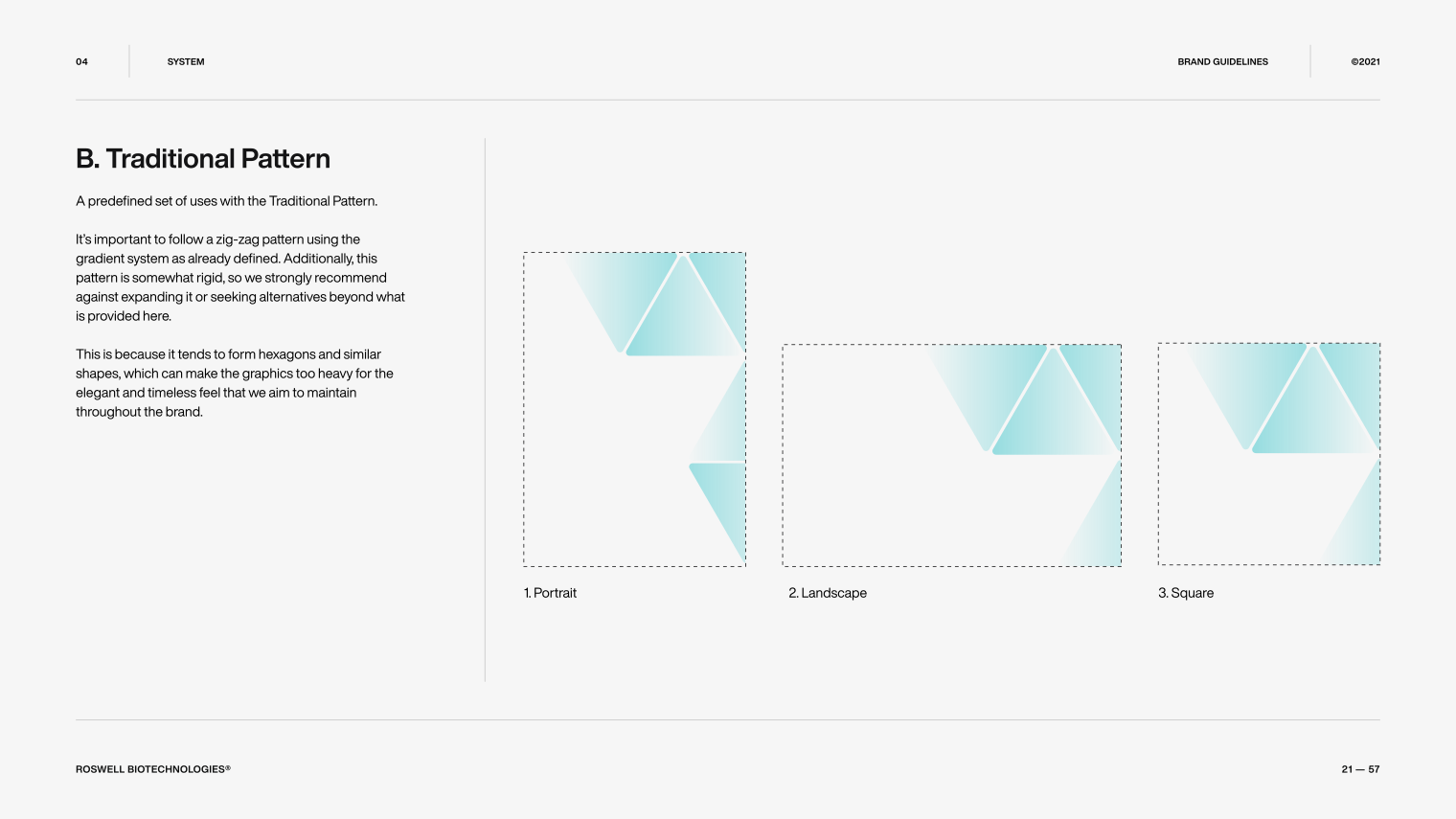
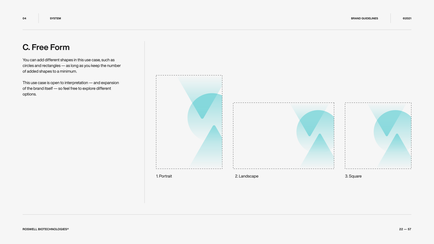
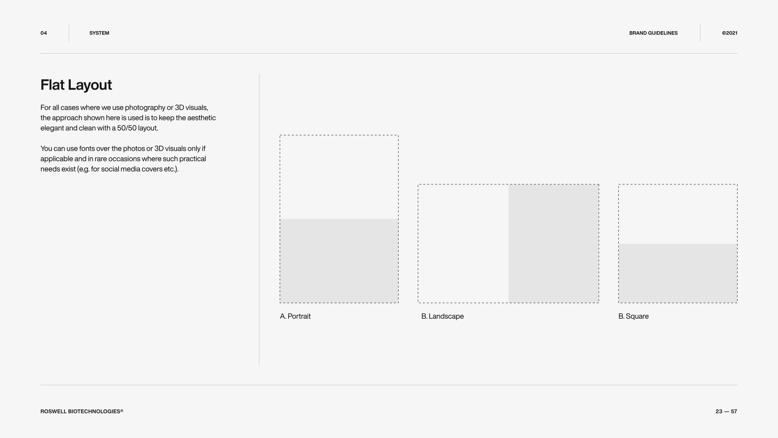
the future of biotech, presented in print
By punctuating the dynamic balance of colors and typography with the elegance of minimalistic accents, we succeeded in creating a stable, scalable framework for all of Roswell’s current and future branding applications.
Print is where all the brand elements come together, letting Roswell’s character speak for itself in a tone of dignified sophistication, with a clear voice that calls the future forward.
Roswell’s dynamic brand system is present in all print designs, changing to adapt to each use case. It showcases the brand’s versatility - as can be seen above.
a Dynamic adaptation for digital application: social media branding
Thanks to its dynamic aspects, the brand system seamlessly extends and adapts its layout to social media, preserving the established fluidity and uniformity of brand expression.
Its range is complemented by custom social media badges, and more importantly, completed with the addition of custom 3D visual assets that serve as the main driver of visual narrative for digital branding applications.
Dynamic layout demonstration
The mockups shown on the left demonstrate how the dynamic layout can adapt to different formats of social media. They keep the brand character consistent, regardless of platform, and adapt to virtually all presentation applications, as dictated by the visual content.
Visual Content
- 3D Visualization
- Storyboard
- Charts
- Photography
- Illustrations
- Video & Motion
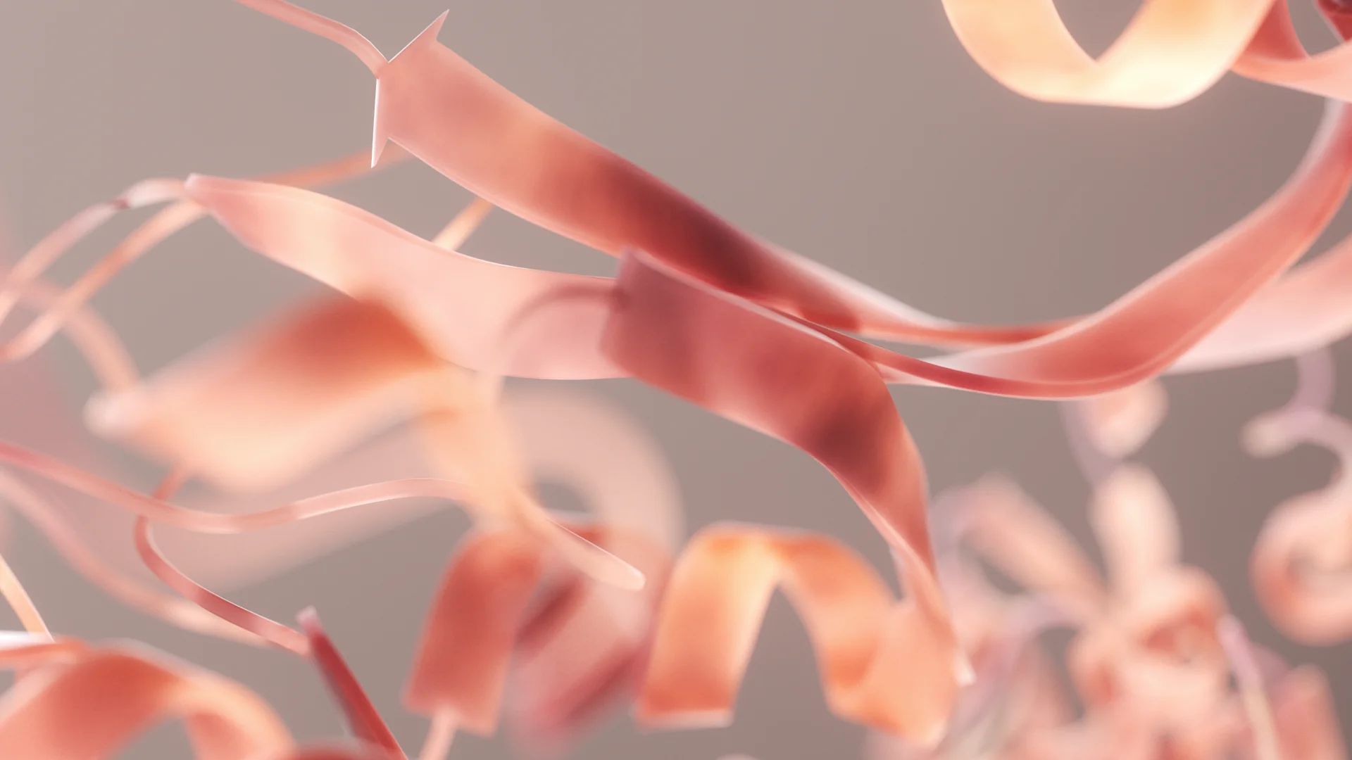
When biology met technology: a true story from the creators of the Roswell ME microchip, brought to you in 3D.
Challenge
Roswell had no visual assets that we could use or modify. This was mostly due to their outdated look that just couldn’t work with the brand’s new style and character, so we had to start from the drawing board, literally.
Besides the obvious challenges when dealing with a truly new and complex technology, our main challenge had another dimension: how to compress that complexity into engaging content. It needed to serve the visual narrative and explain the core principles of Roswell’s technology, and the product they offer.
Adding to our predicament, Roswell needed a complete suite of visual assets: animated, static, interactive, 2D, and 3D. Suffice it to say, we had our work cut out for us.
Direction
The first thing we did was establish an elegant and timeless aesthetic that fits perfectly into the newly formed brand’s sophisticated style and serious character.
Focusing our approach on telling the story of Roswell’s ME chip in an interesting and authentic manner, we broke down the story into three key aspects:
1. The biological: the underpinnings of the technology.
2. The nano: where the actual technology resides.
3. The macro: where you can actually see the technology (the chip).
After a few intensive sessions with Roswell’s science team and Paul Mola (the CEO), we had all the information we needed to start creating the visual assets that we’d later use to weave the chip’s story together. The visual system was engineered for a deep tech audience: investors, semiconductor partners, and the scientific community.
Result
Considering its technical accuracy and precision in presenting such a complex technology, this is the best 3D experience we’ve made thus far.
We layered the different levels of narrative to form an elegant flow of information and visual appeal.
This flow is attained by not forcing the information onto the user and letting the visual appeal of the animated content speak for itself. All we did is invite the user to participate in uncovering more about the technology.
Once all our work came together, it resulted in a beautiful introduction to the Roswell ME Chip™ from multiple aspects of both technology and application.
With these assets, the visual narrative leaves users engaged and sufficiently equipped to explore the technology and see its value for themselves.
The cornerstone of the entire project is the animated video that introduces the Roswell ME Chip™ in its three key aspects (bio, nano, and macro).
Beginning with the storyboard (left) and the animatic (right), we arrived at the finished video featured on the website (below).
From concept to completion, this is the story behind the story of the Roswell ME Chip™.
the beauty of biotech, captured in motion : the Roswell ME Chip™
Designed from the ground up, in house, The Roswell ME Chip™ animation is the centerpiece of our visual narrative. It’s also the backbone of most of the visual assets themselves, being that many of them were derived from the models we created for this animation, including digital and print.
As our most prestigious asset, it captures the essence of Roswell’s character and beautifully expresses the boldness and sophistication of their technology.
a point of interest: iconography in motion
These animated icons were made as visual abstractions that represent the core features of the Roswell ME Chip™, illustrating its key advantages over its competitors.
Each animated icon symbolizes one core feature, but also encompasses two or more key advantages that result from that core feature.
Through motion, the animations expand on the functionality of the core feature as the supporting elements morph and shift through representations of the ME chip’s advantage in that particular aspect.
Meanwhile, the backgrounds are stylized to represent the “big picture”, providing symbolic context to the animations, as well as additional meaning to the icons themselves.
As depicted by the animations, the core advantages that the Roswell ME Chip™ are:
1. Speed
2. Cost
3. Size
4. Resolution
5. Simplicity
Resolution
Cost
Simplicity
Speed
Size
the invisible visuals: supporting assets
One of our main objectives was to raise the bar in online presentation of biotech companies and their technologies. For this, we needed exceptional supporting visual assets that would enrich the user’s experience and clarify the technical points made with explanatory text.
However, the true value of these assets is found in the balance they provide: they add to the eloquence of the visual experience without oversimplifying, or overcomplicating, it with charts, text or graphics.
Using these assets to mediate between clarity and high information density, we were able to create a rich and easily palatable experience that elevates Roswell’s presentation to an entirely new level, both technically and aesthetically.
all futures, all on chip: the market potential of Roswell’s ME Chip™
In a few steps, this interactive chart gradually leads the user through a projected shift in the biotech market, offering quick textual explanations for each key point.
Overall, the chart illustrates the anticipated market dominance of Roswell’s ME chip by highlighting the shift in market share from optical to electronic AOC products.
all signal, no noise: the ROswell Me sensor
Supported by explanatory text, this interactive graphic shows the actual signal data collected by the molecular sensors inside Roswell’s ME chip. It depicts the chip’s superb sensitivity in all three major categories of detection (DNA/RNA, proteins, and small molecules).
molecules in motion: interactive sensor demo
Simplified without sacrificing technical accuracy, this interactive graphic perfectly demonstrates how the sensors on the Roswell ME Chip™ work in real-time.
Designed to offer users a hands-on experience, the interactive graphic clearly describes each of the sensor’s major components and their functions in practical terms.
local detection, global prevention: pathogen tracking
This simplified, interactive 3D visualization simulates the spread of pathogens across a city. It showcases the full potential of the Roswell ME Platform™ as a mobile diagnostic and detection device, enabling real-time tracking of different pathogens.
getting the all clear: biosensor signal resolution
This interactive waveform graphic visualizes a direct reading by the Roswell ME Chip™, highlighting its exceptional signal quality and detection resolution. When compared to current technologies, the chip's sensors can clearly register even the slightest amount of target biomaterial.
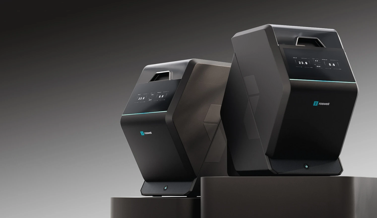
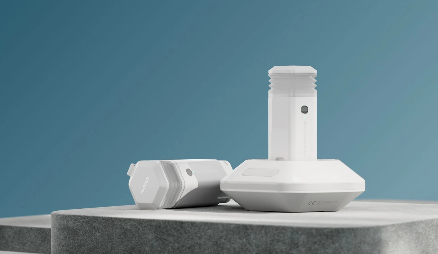
molecular Biology applied to desktop technology
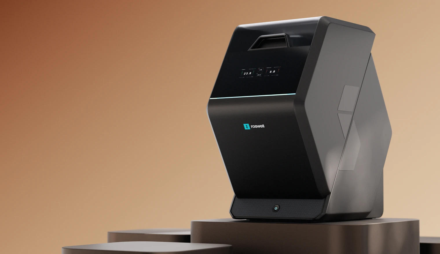
Stepping into the field of industrial design, we needed to enhance Roswell’s 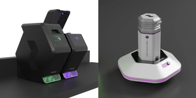 old assets to reflect the aesthetic of the new brand and complement the visual narrative of our new 3D assets.
These assets serve to portray potential, varied applications (e.g. genome sequencing, molecular diagnostics). Their design needed to preserve the elegant aesthetic and express the brand’s character in no uncertain terms. However, it also needed to be sufficiently flexible, so that the assets could be used in multiple different contexts in the future.
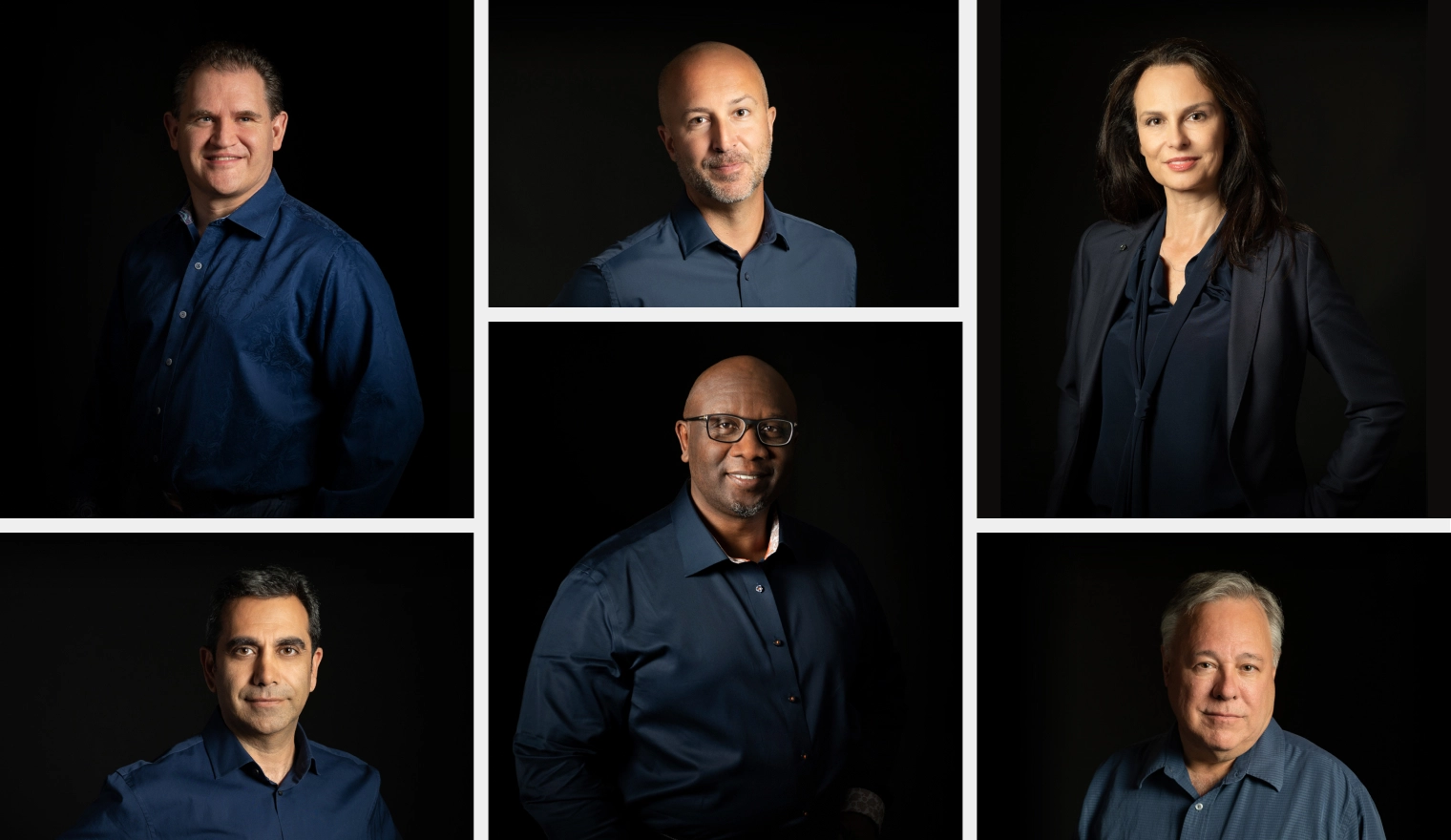
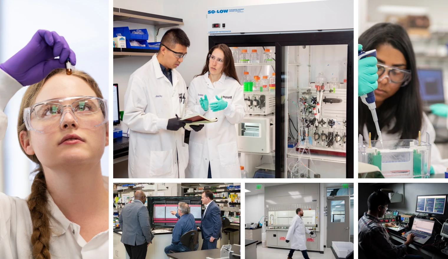
Roswell on film: photo & Video art direction
We needed to show where Roswell gets its character from, and there is no better way to do that than through telling the story of its people.
To let their character shine, we developed a comprehensive art direction package for photography and video. It covered everything from composition to interactions, culminating in a unique visual style that complements the brand image.
This approach set the tone for interviews and photo shoots, aligning with the brand's visual aesthetic. It ensured each piece highlighted the individuality of team members, allowing Roswell Biotech to speak in its own voice, the voice of its people.
Website
- UX design
- UI design
- Interactions
- Lotties
- CMS
- Webflow
Roswell Biotechnologies: the beauty of molecular biology riding the cutting edge of technology, in its new Rolls.
Challenge
Roswell’s new website needed to be the apex of the project: a purified amalgam of all the elements we’ve created, each designed to shine and help position the company ahead of the competition.
Our aim was to create a strong online brand presence to match the disruptive and innovative nature of Roswell’s molecular electronics technology, while also educating the user and potential partners on its capabilities.
This was challenging as at its core, it represented a merging of two industries, biotech research and semiconductor manufacturing, into an engaging and visually eloquent storytelling experience.
‘The Rolls Royce of biotech websites’: we made a promise, and we were going to keep it.
Direction
Our approach was completely focused on infusing Roswell’s new website with its newly-developed character that we’ve defined in the branding phase.
We devoted special attention to typography and the color palette, making absolutely certain that it integrated seamlessly with the new 3D visuals.
The aesthetic was completed with just a shade of “futuristic,” adding an accent of novelty to the ultimate goal of making the website represent Roswell as a serious, competent and confident, technology company with a revolutionary product.
Result
Roswell’s website hosts the perfect blend of visual storytelling narrative, interwoven with critical information in a naturally comprehensible manner that fosters retention and interest, with minimal prior knowledge of basic science required.
The crown jewel of the website, Roswell’s Molecular Electronics Chip™, is elegantly presented through interaction, following the highest possible standards.
All our efforts came together to form an intricately designed experience and offer the user the very best of Roswell Biotechnologies.
a good first impression goes a long way: the home page
Design is all about first impressions, and we wanted Roswell’s to shine.
Welcoming the user with an animated visual of the Roswell ME Chip™ installed into a standard socket on a motherboard, we immediately make it clear that Roswell Biotechnologies is a product-oriented molecular electronics company.
As the user is led through the sections, the page highlights the potential of Roswell’s new chip: advantages, market share projections, applications, and ending with the main CTA that leads to the Chip page.
home is where the phone is: mobile
From the onset of the design phase, the mobile version of Roswell’s webpage was a focal point, as we needed to make sure the unique sections showcasing Roswell’s character were as impactful on mobile as on the desktop version.
The same attention to detail and functionality was given to the supporting visuals, fostering immersive storytelling.
a beauty and a beast: roswell me chip™ page
Primarily driven by the visuals, the Chip page is the most story-driven page on the website.
Starting off with a long-form, interactive 3D animation in the hero section, the page introduces Roswell’s flagship product: The Roswell ME Chip™.
As the user scrolls, this interactive animation covers the aforementioned three key aspects of the chip’s design, while staying technically accurate and explaining its functionality, step by step.
Beyond the hero section, the inner-workings of the chip are further explained through an interactive 2D-animated schematic of the chip’s circuit.
Moving away from the theoretical and into the practical, the following two animated sections elaborate on the sensor itself, highlighting its range of detection and associated advantages.
Accentuating the novelty of Roswell’s biochip, the last section briefly covers the history of molecular electronics. Providing the user with historical context, it clearly denotes the leap in technology and capability that Roswell had achieved.
a partnership with the platform of biomolecular progress: partnerships page
With an animated 3D wireframe of the Roswell ME Chip™ in the hero section, the Partnerships page makes it clear that Roswell Biotechnologies is always looking to improve on its designs.
Although streamlined, the rest of the page still follows the established brand aesthetic as it continues to elaborate on the Roswell ME Chip™ Partnership Program.
the people behind the biochip: about
This page focuses on introducing Roswell’s vision and the key people behind it.
The first, interactive section depicts Roswell’s vision: how digitizing biology will transform health and allow for active disease surveillance by making testing available through mobile devices.
However, at the core of this page is the ‘Founders Video’, prominently featuring our photography art direction.
This short-form interview is among the most important pieces of content on the website, as it offers a profound insight into the character of the people who are the backbone Roswell Biotechnologies.
More information on Roswell’s founders and other key team members is also available through their stylized portraits, as they expand into full-screen to serve as the biography section.
products from the future of biotech: applications page
The Applications page outlines all the benefits and advantages of Roswell’s new ME platform, crafting a natural flow of both visual and technical information that facilitates curiosity and doesn’t overwhelm the user.
An example of this would be the animated/interactive waveform.
Abstracted from the sensor’s actual readout, the waveform animation allows the user to zoom in and out, experiencing the significant leap in precision achieved by the Roswell ME Platform™ by comparing it to the current industry standard, to scale.
However, the heart of this page resides with the visual assets that introduce the user to the chip’s benefits and fields of application:
- Genomic Sequencing
- Molecular Diagnostics
- Basic, Discovery & Translational Research
- Growing Applied and Industrial Markets
a sequence of product applications: Genomic sequencing devices
The Genome Sequencing Application page opens with the redesigned 3D model of the device, as it comes into full view in the animated hero section.
Letting the user take control of the flow of information, the page uses animated sections to go over the capabilities and advantages of each individual device, contrasting them with current industry standards and average costs.
Before listing the device’s key attributes, the advantages of the Roswell ME Chip™ are highlighted through the Chip Assembly Section.
This interactive section uses scroll-triggered animations to let the user assemble the chip step-by-step: each stage of assembly coincides with the revelation of a new benefit, crafting an immersive, informative experience.
the genome goes mobile, in sequence
As with most of the pages on Roswell’s website, the Genome Sequencing page required special layout treatment. This ensures that the mobile viewing experience offers the same level of authentic storytelling we’ve achieved in the website versions.
democratizing diagnostics, delegating drug discovery: discovery and diagnostics product pages
The Molecular Diagnostics and Discovery pages highlight products powered by the Roswell ME Platform™. These products are designed for molecular diagnostics and drug discovery, tailored for both personal diagnostics and clinical research applications.
The pages maintain a consistent aesthetic with other Product pages, showcasing redesigned 3D animations of the devices and highlighting the platform's key advantages.
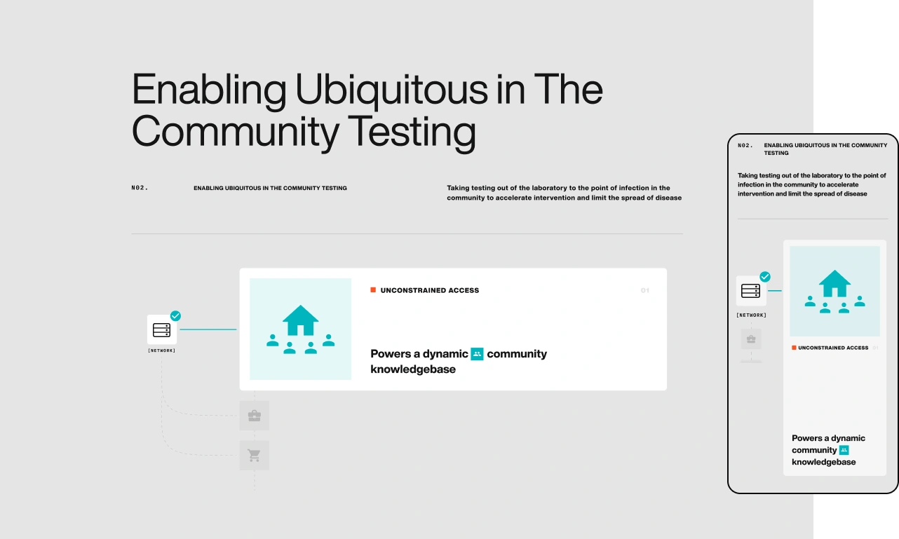
However, a distinct feature lies at the end of these pages: the Interactive Storyline and Dynamic Discovery Chart sections, which are detailed further in the next section.
the dynamics of interaction: diagnostic Storyline and discovery chart sections
1. The Interactive Storyline section on the Molecular Diagnostic page focuses on devices for personal diagnostics, pointing out the benefits they could have for communities as a whole.
As the user scrolls, the section walks the user through the key points of forming a disease / pathogen database, explaining how such databases would benefit both individuals and communities in preventing outbreaks by identifying diseases before they manifest in individuals.
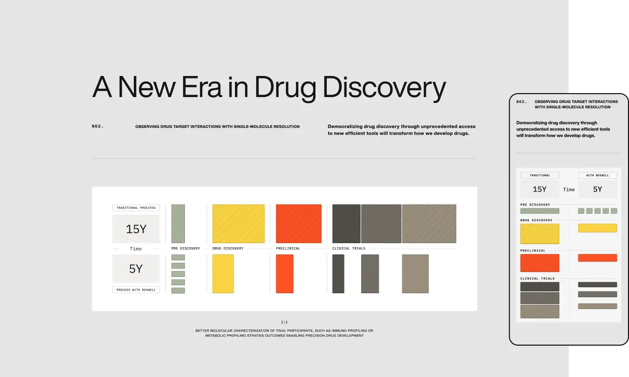
2. The Dynamic Discovery Chart on the Discovery Page focuses on the economic benefits of using Roswell’s platform for a targeted approach to drug discovery.
By making the chart interactive, we invite the user to explore the cost-effectiveness of Roswell’s platform during key stages of the drug discovery and evaluation process.
help build the world’s best biosensor: careers page
The Careers page is designed to present the unique culture of Roswell Biotechnologies and introduce the amazing team behind the company’s progress.
Using employee testimonials and photos, we gave potential candidates a real insight into the company environment and culture.
More importantly, we presented the company’s key values by introducing the individuals behind the testimonials through short video interviews.
- FIFTYSEVEN are in a class of their own when it comes to complex technology storytelling./Roswell Biotech, Founder, President & CEO
Paul Mola
Founder, President & CEO
Outcome
We launched Roswell Biotechnologies’ new brand and website in late 2021, establishing the reputation and image to match a company on the rise. On that foundation, Roswell (biotech) raised $50M+, carrying the same brand into its next chapter; the company continues today as SemiconBio.
- Client:Roswell Biotechnologies
- Timeline: 5 Months
- Sector:
- Industry:Biotechnology
- Country:U.S.A.
- Services:Competitive AnalysisCreative DirectionArt DirectionBrand IdentityBrand ApplicationDesign SystemPhotography Art DirectionVideography Art DirectionPitch Deck DesignGraphic DesignIllustration3D VisualizationVideo & MotionWeb UX DesignWeb UI DesignWebflow DevelopmentContent Management System