


Enzian Health

Building a healthcare community for all communities across the Alps: an authentically Swiss take on wellness.
Project Overview
Back in 2020, “Enzian Health” was just an idea of establishing a network of professional healthcare communities. Today, Enzian Health (digital health) is a company offering a holistic approach to healthcare across rural Switzerland.
From the onset, Enzian’s vision was grounded in offering health services that were either unavailable or hard to access for these communities, focusing not just on prevention and remediation but also general wellness and healthy living. They were determined to create a network of health centers that would end up bringing modern, patient-oriented services to the local populations of Switzerland’s remote areas.
00:58
Play
Brand Strategy
When the founders of Enzian approached us in 2020, telling us they had a name and a business idea for a health company, it immediately became clear that the success, or failure, of the entire endeavor would rest on the shoulders of its brand strategy.
Before defining Enzian’s brand strategy, we needed to solidify their orientation. That translated into extensive research and workshopping during the first phase of the project.
Once we had refined our research down to the best available approaches, we presented our clients with the curated strategy proposals. Soon after, we had our challenges defined and our trajectory set.
In simple terms, we concluded that the brand had to overcome a great deal of mistrust and prejudice associated with private healthcare in Switzerland. It also needed to make a strong case as to why it’s better than the alternatives: insurance-owned and state-owned healthcare providers. It needed to express all the benefits and eliminate the drawbacks of each.
Positioning
Enzian’s company goals were only achievable if they were positioned to appeal to enough individuals with the necessary skillsets. These individuals would form the healthcare communities providing services to local populations, ensuring a diverse, and locally relevant, service spectrum
That meant that the key stakeholders were physicians near the end of their careers, young medical practitioners, and general health experts who are looking to build their careers and are willing to move to the rural areas of Switzerland.
Besides health professionals, Enzain Health’s brand also had to appeal to the local populations of those rural areas with town-specific services, regardless of the general benefit of having a modern health center within walking distance.
The key factor in achieving this appeal was ensuring that everyone involved sees the value in such an endeavor at first glance, becoming encouraged to seek out the specific health service they’re interested in, be it as a patient or health professional.
Challenge
What sets Enzian Health apart is their approach to building their healthcare communities. They merge the time-honored tradition of seasoned professionals passing down knowledge to newer generations, with a contemporary approach to healthcare: new methodology, the latest technology and innovative ideas.
With that, our main challenge was clear: ground zero branding for a highly diverse community of health experts that brings patients and professionals of all ages together around shared values of health and healthy living, before there was any such community to speak of.
Approach
Since the problem was so complex, our solution was simple: build it, and they will come.
Taking Enzian’s values and business plan, we formed them into a comprehensive brand strategy outlined as “community redefining” with the basis of its character defined as “premium holistic”.
Basing our approach on the key objectives listed below, we told the story of a brand that serves its patients, professionals, and communities through independent, local health centers in rural towns across the Alps.
Objective
- ①
Create a premium brand that tells the story of health professionals and ordinary people coming together to form communities seated in values of health and wellness.
- ②
Highlight the aspects of brand character that unify traditional values and modern perspectives in healthcare, appealing to both older and younger generations of health professionals
- ③
Find a visual tone & voice that translates perfectly to digital space and applied interior design, while being customizable enough to compliment the specific services offered by each individual health center.
Branding
- Logo design
- Color palette
- Photography
- Brand applications
- Social media
Venerable and versatile: the brand of a modern healthcare community, grounded in tradition and excellence.
Challenge
The brand had to appeal to core audiences that are typically on two polar opposites: one conservative and traditional, and the other modern and liberal.
To add to the challenge, the third, and equally vital, part of the audience came with their own prejudices regarding private healthcare, which had to be resolved gracefully.
The final challenge was the spectrum of application. The brand had to express Enzian’s core values firmly, while being flexible enough to suit all applications for individual clinics across print, web, and applied interior design.
Direction
Our approach centered around using some brand elements to speak to individual stakeholders, while using others, more consistently present ones, to bring all stakeholders together in a unified whole and form a sense of security, trust and community.
In terms of art direction, our target was the stature of a modern, premium healthcare provider that evokes a sense of nature and tradition; all the while providing the comfort and security of high-quality medical professionalism.
Result
Enzian’s brand was designed to shape its appeal through composition and contextual application.
The brand itself is grounded in a tone of elegance associated with the stature of medical tradition, as evident by the refined color palette and typography.
A clean aesthetic compliments this tone, but also builds a sense of the brand’s modernity through minimalistic design.
Overall, the voice of Enzian’s brand is one of calm authority, evoking a sense of trust and familiarity: a modern healthcare community grounded in tradition and excellence.
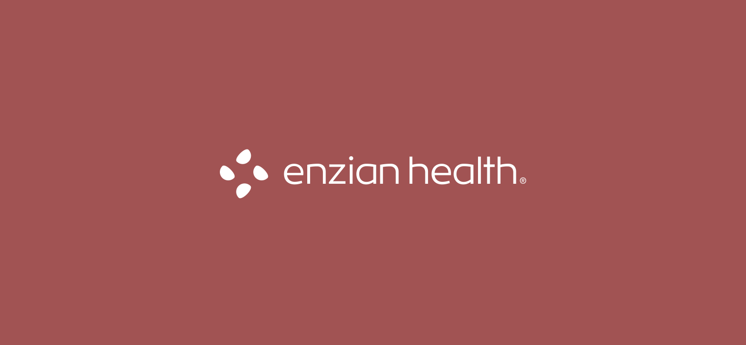
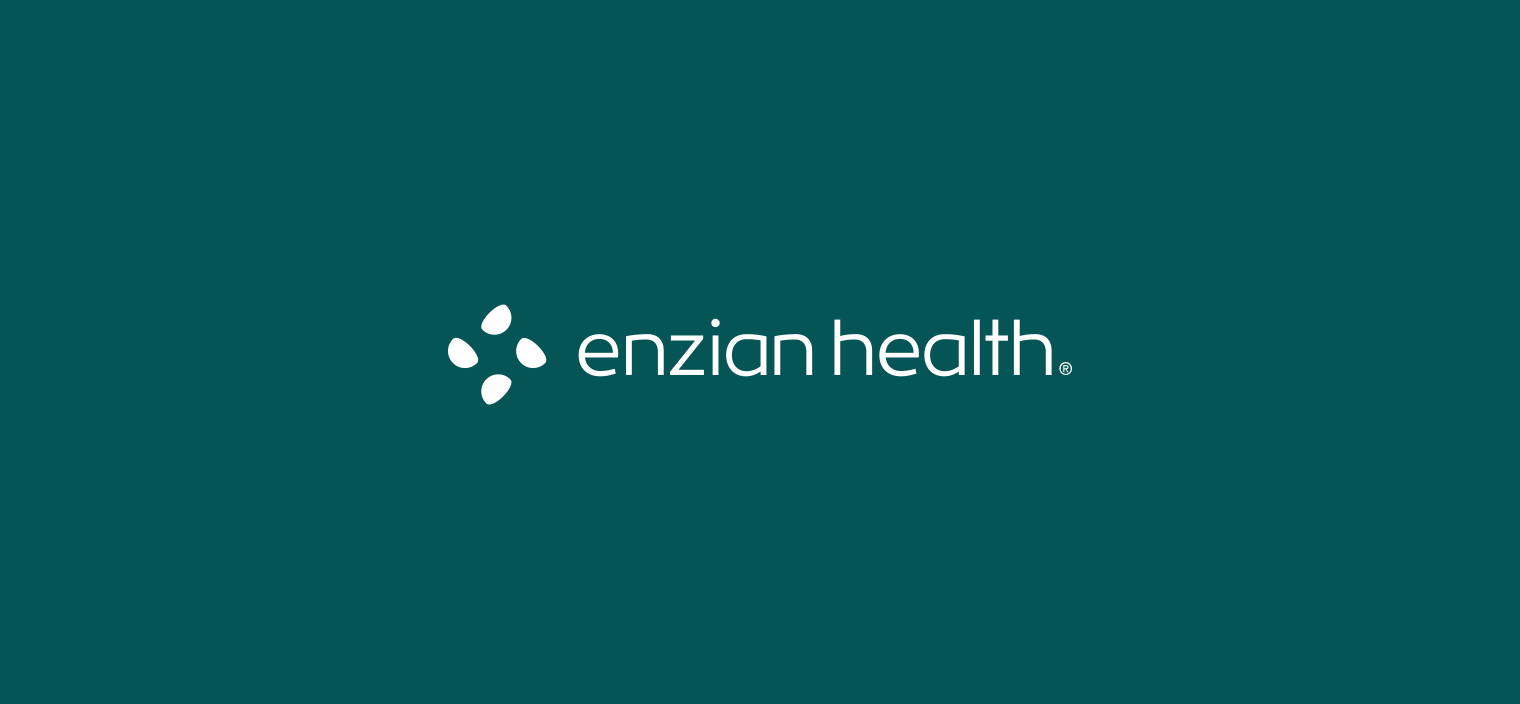
Enzian’s logo: A symbol of health and community
Derived through a complex storytelling exercise, the logo has multiple levels of interpretation, each unique to specific groups within Enzian’s target audience.
As depicted above, the logo symbol in its most general form alludes to the shape of a Swiss cross, symbolizing health. Its elements, minimalistic petals, are rotated to represent the coming together of people, illustrating a community.
However, to anyone familiar with the rural parts of Switzerland, the logo symbol has a strong association with the word “Enzian”: a wild flower indigenous to the Swiss Alps. This establishes immediate familiarity and sense of tradition towards the brand, forming a strong foundation for building brand trust further.
Colors and typography: A holistic palette of health and natural authority
Staying true to the principles outlined in the brand strategy, the main color palette was refined to a single main color: Deep Royal Green. It carries the message of calm, natural authority through its association with the medical profession and deep water, evoking a sense of respect and security.
The supporting earth color tones compliment this sense by providing an air of comfort, warmth and familiarity. Black and white are used only to add contrast and accents to narrow focus down to a specific point.
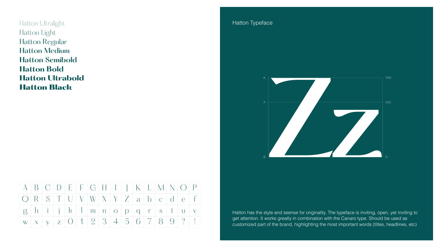
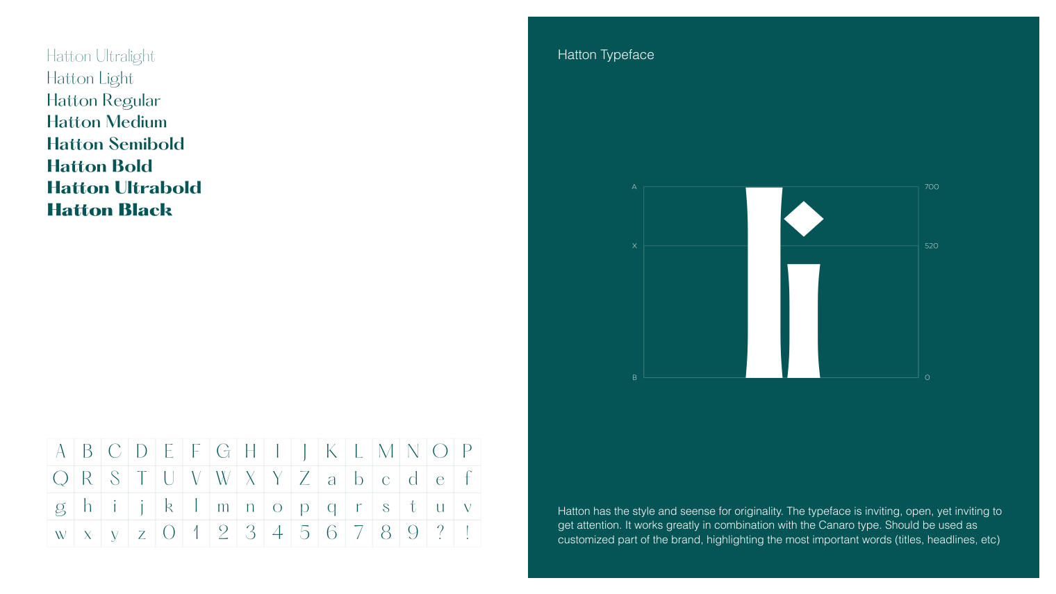
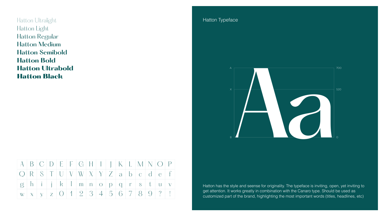
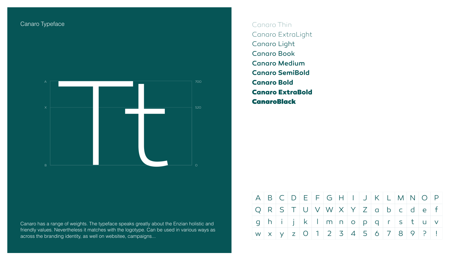
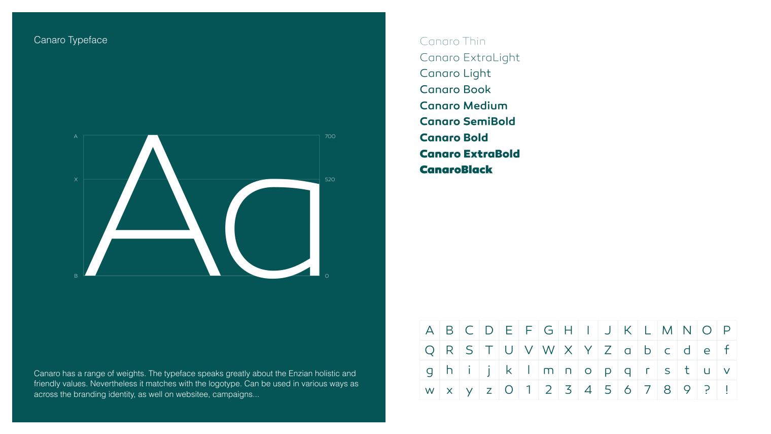
Enzian’s typography adds clarity to the brand’s message by focusing the tone set by the colors into a clear voice that directly speaks to the brand’s character. In essence, it is the pillar of visual communication for Enzian’s brand.
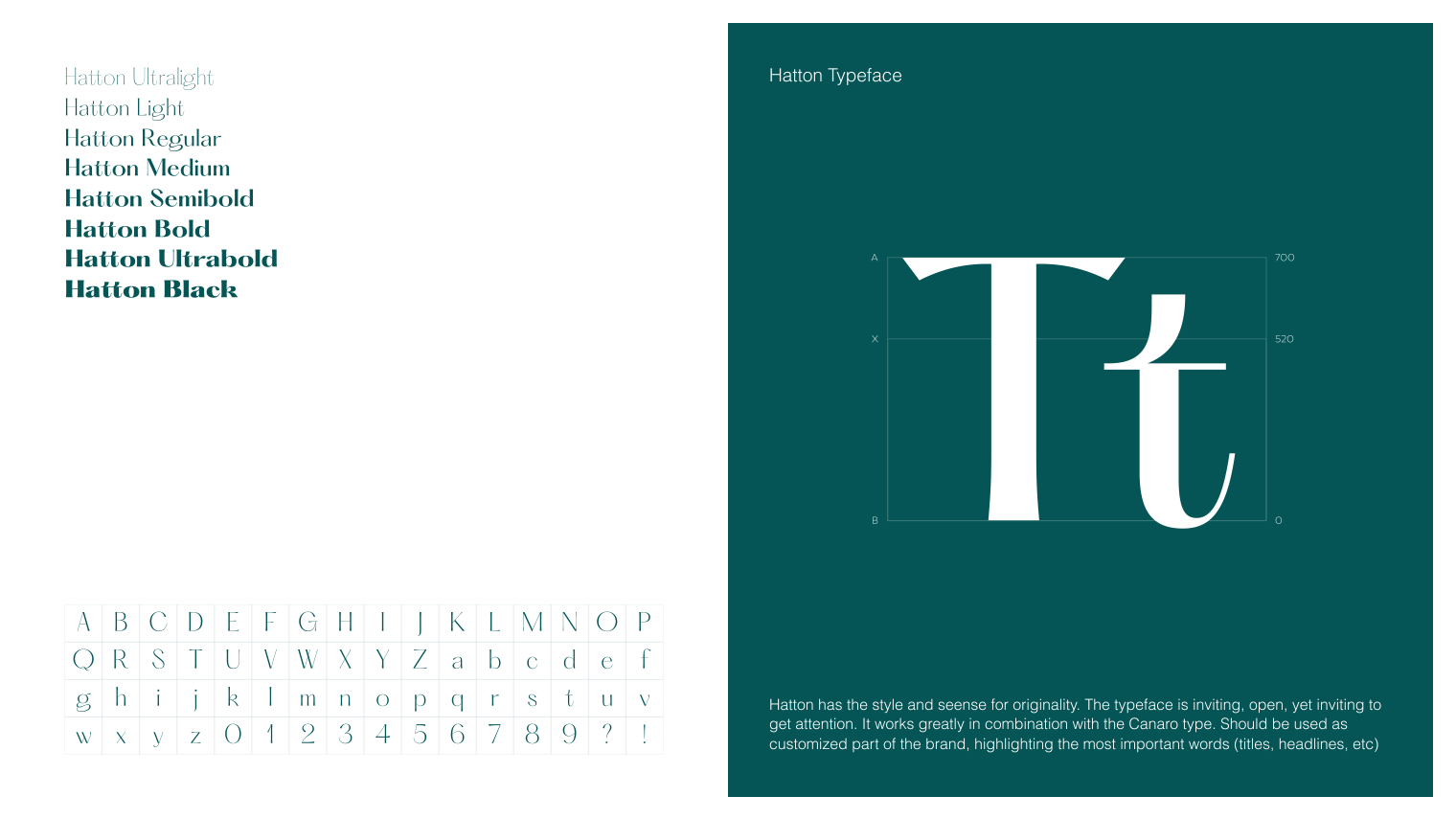
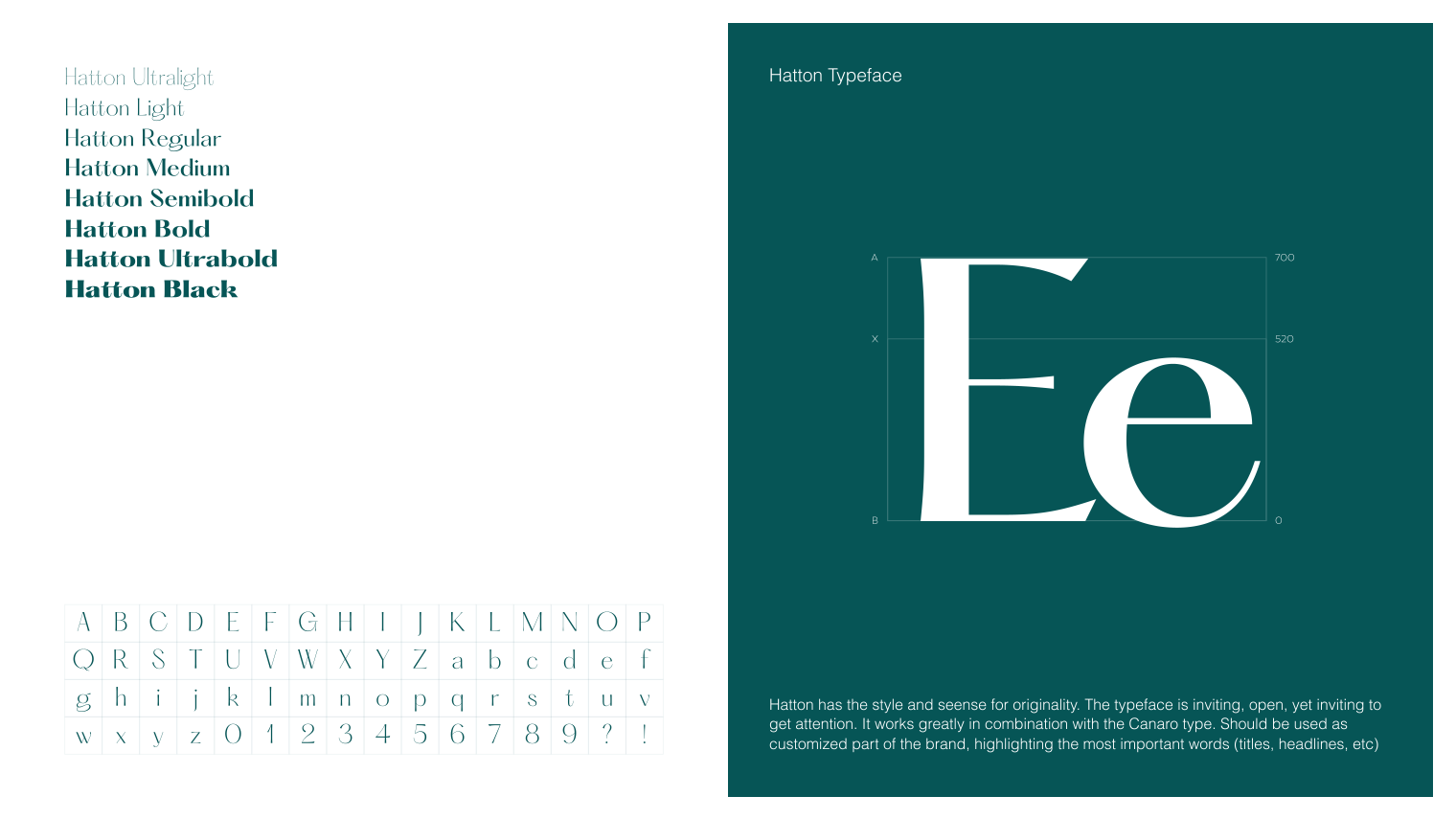
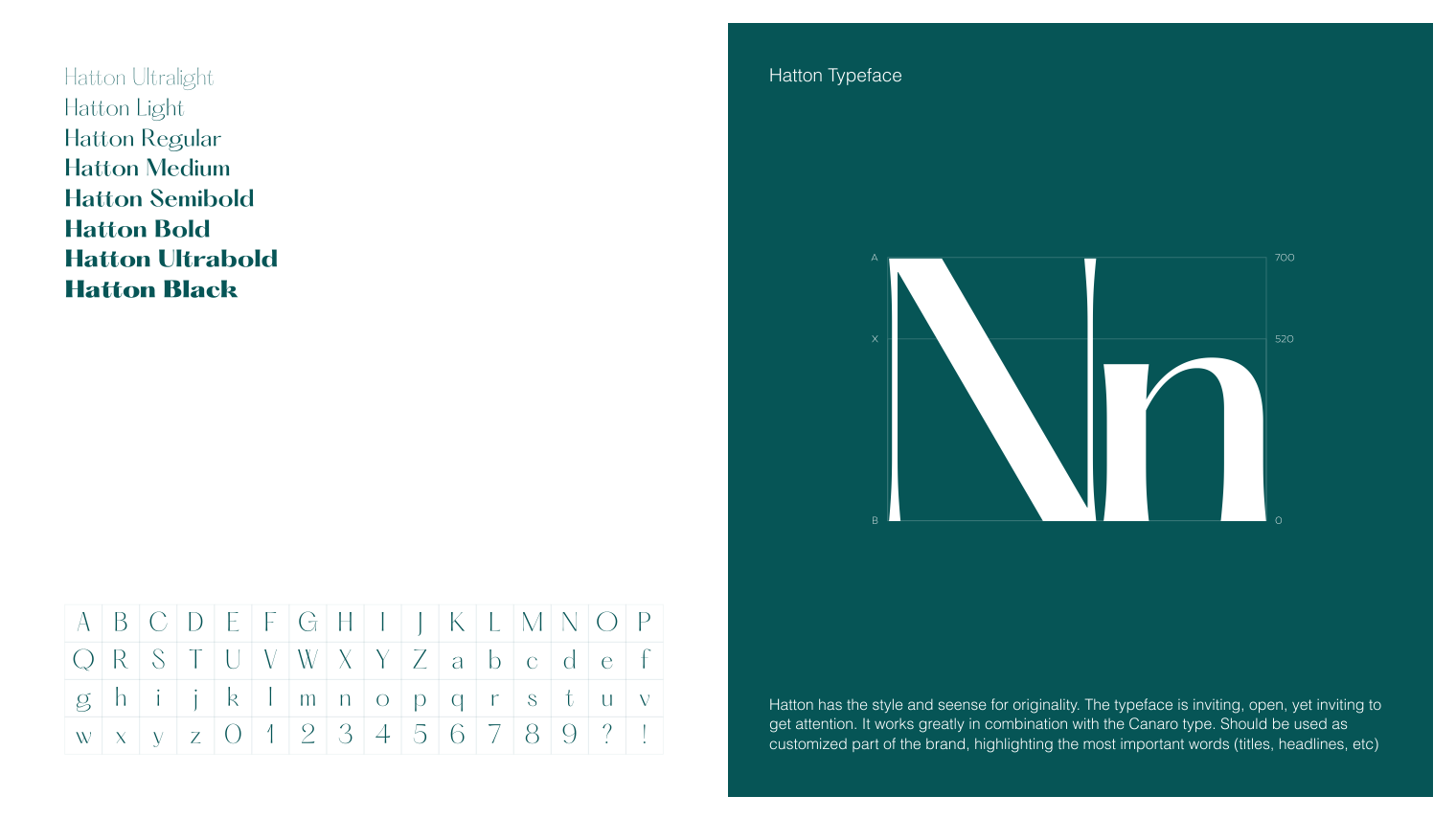
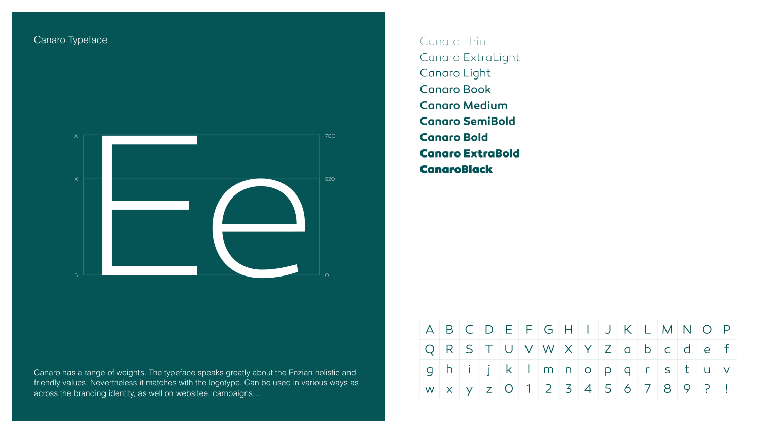
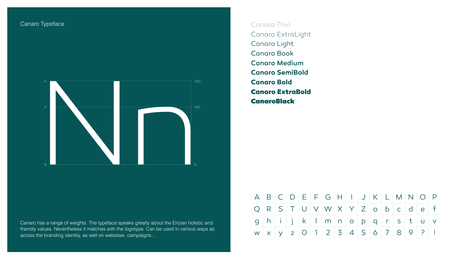
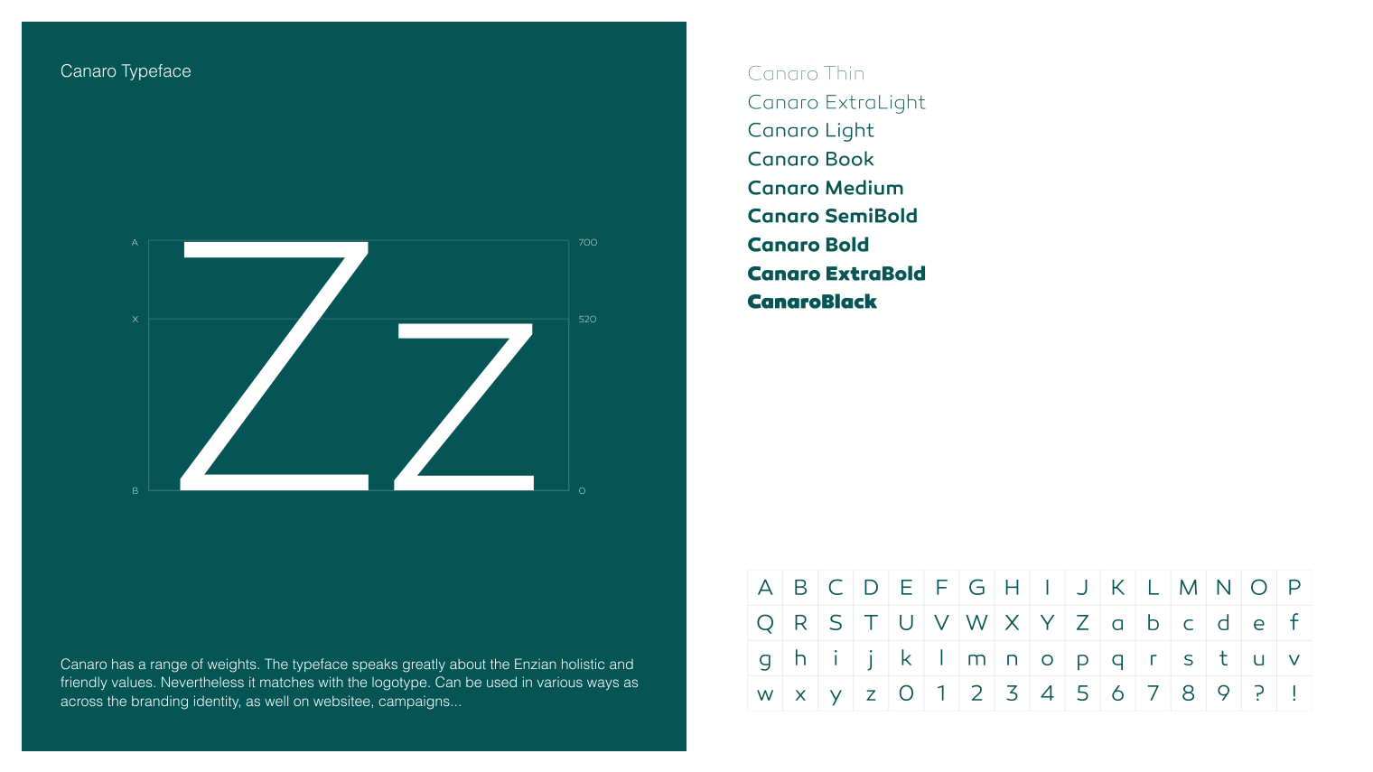
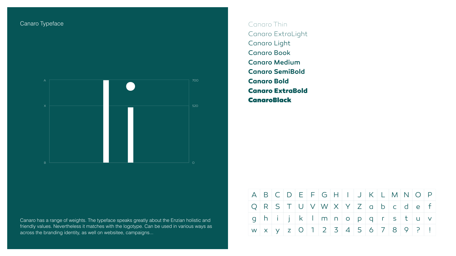
The main typeface, Hatton, reflects Enzian’s premium service, furthering the sense of elegance and medical professionalism.The Canaro typeface serves as a contrast to the main font, giving us the perfect balance of style and practicality with its clean aesthetic and modern simplicity, as well as its exceptional legibility.
Once used in their desingated roles, all these contrasts begin to layer and merge together to form a unique, yet familiar, style with a wide range of appeal and diversity of expression.
branding brought to life: the first enzian health center, in color
Enzian Health went above and beyond to bring their brand to life in all its colors. They put their trust our strategy, adhered to all the guidelines of their branding and achieved astonishing results.
We put this forward as a testament of what trust and strategy can do for a company’s brand. And since actions speak louder than words, we’ll let the results speak for themselves.
health, in print: collateral
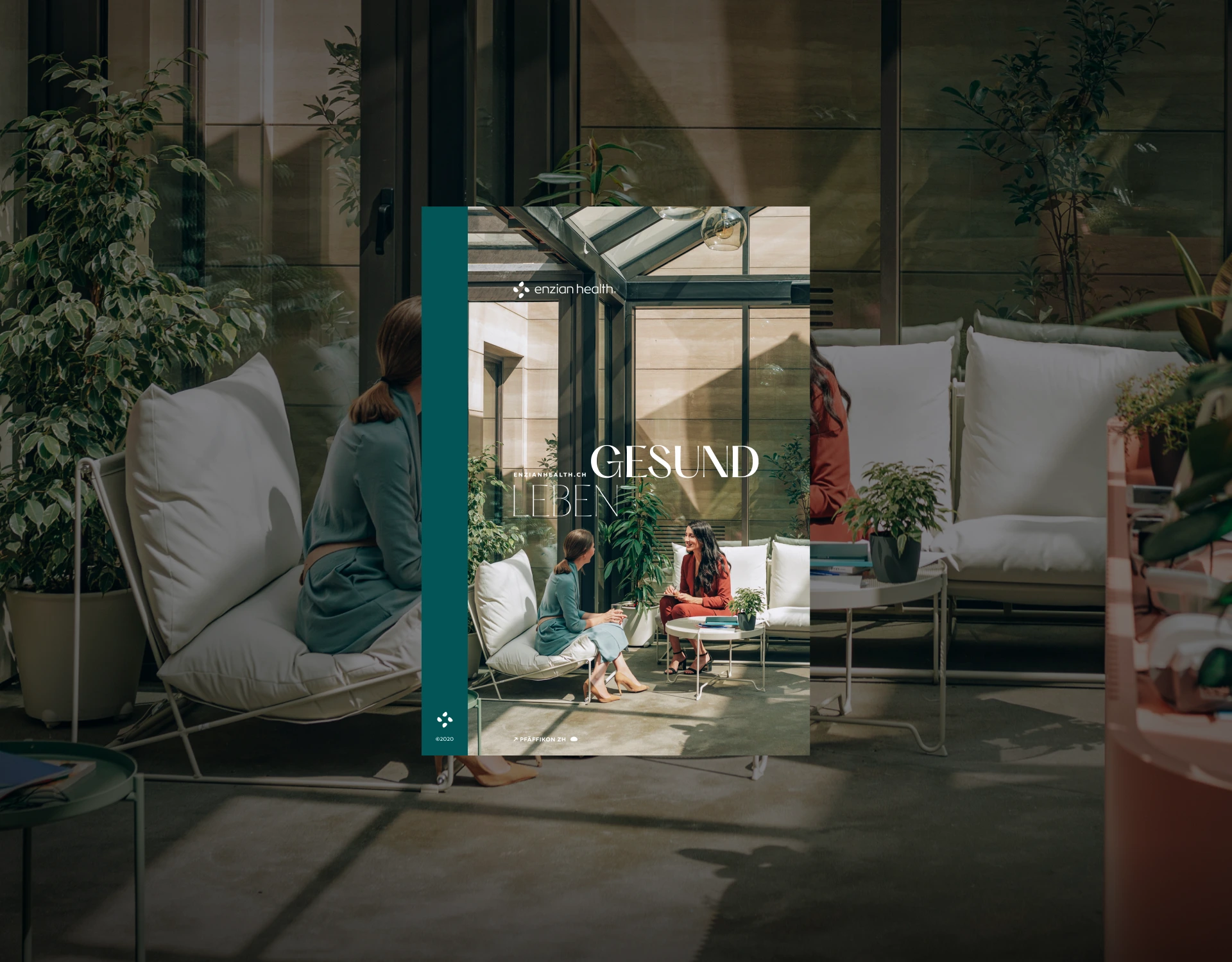
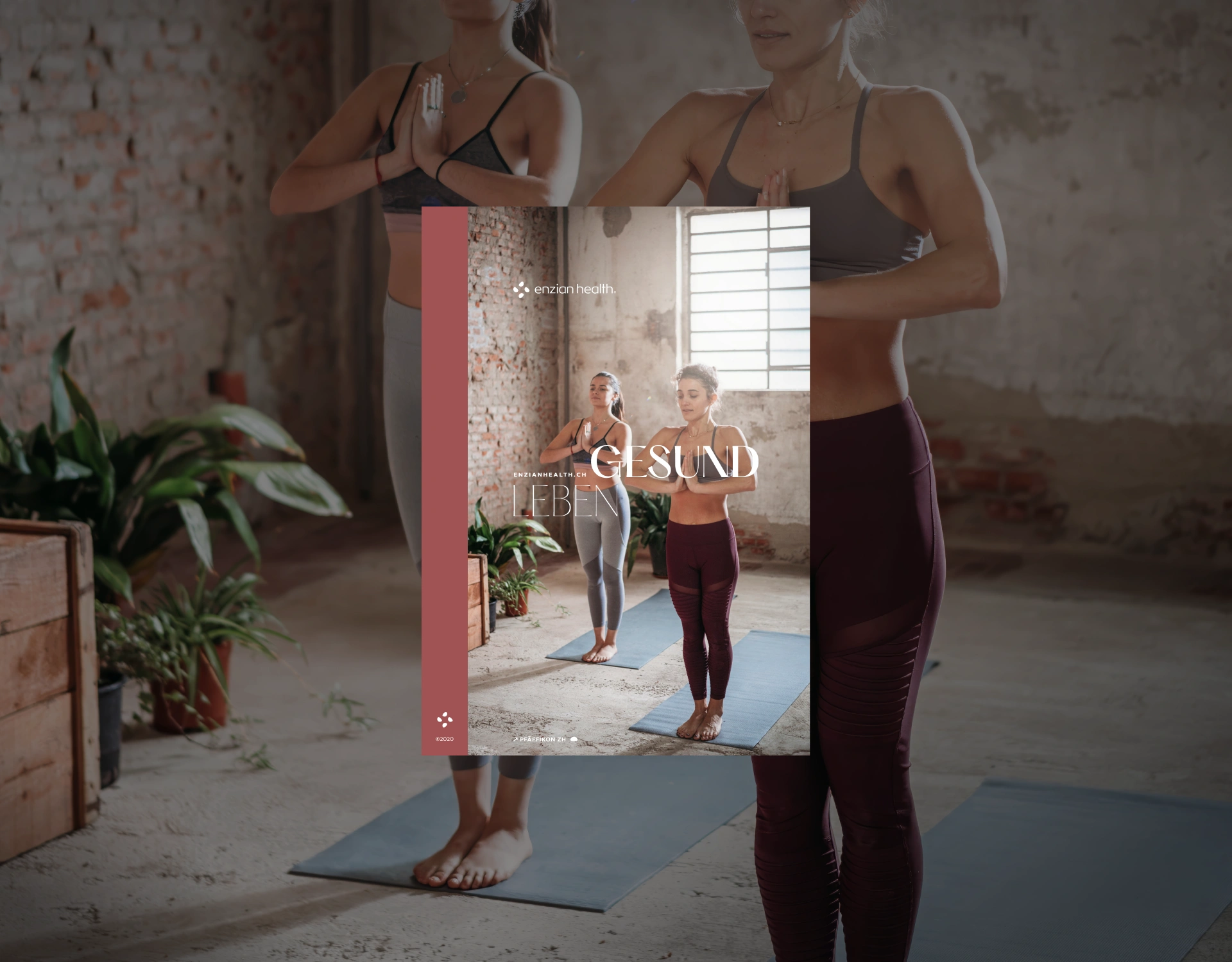
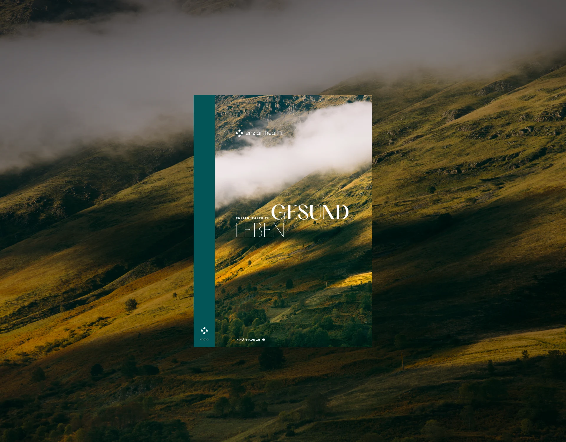
Focusing on more traditional print applications, Enzian’s branding keeps with the branding strategy.
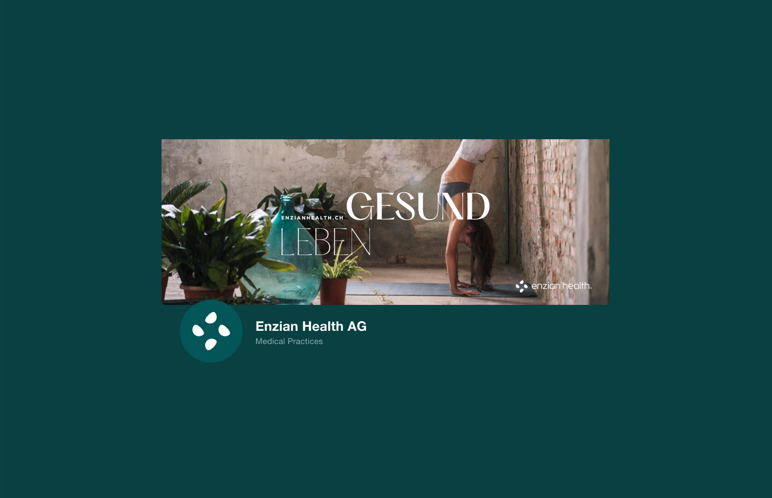
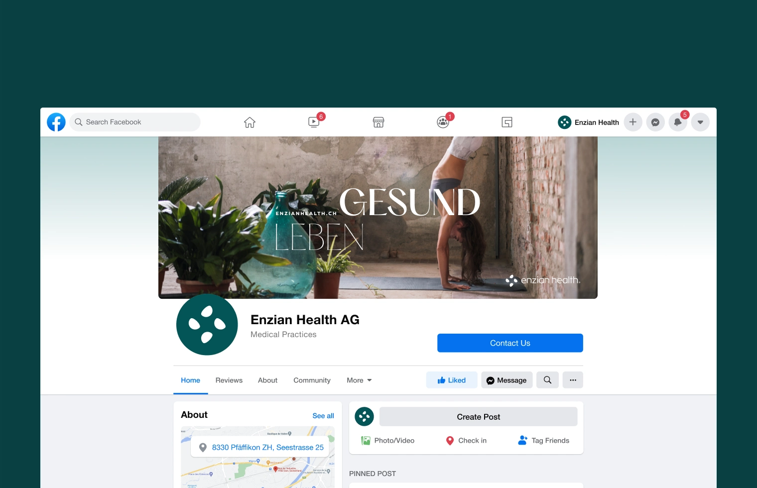
It preserves a clean, elegant aesthetic and strikes a balance between sophistication and approachability through its use of color and typography, carrying Enzian’s message of healthy living (“Gesund Leben”) across all mediums.
Besides branding for letters, memos, business cards and magazines, Enzian’s collateral also includes a social media kit.
Website
- Web UX
- Web UI
- Interactions
- CMS
- Webflow
Gesund Leben: a holistic approach to wellness, reflected through elegant design in a portrait of healthy living
Challenge
Due to specific project requirements, we had to resort to using the Webflow platform to build the website. This presented a stylistic challenge due the inherent customization constraints that come with using a website building platform.
The website also needed to be expandable, as to provide a means of adding content and linking new health centers to Enzian’s network as they come online; but the branding needed to stay consistent.
Nevertheless, there was no room for compromise when it came to the visual narrative.
Direction
The Webflow platform has its limitations. So, assuring that Enzian’s website carries the visual narrative, with integrity of character, had to be delegated to the one aspect of design we had the most control over: the UX.
In terms of functionality, we needed custom features in the form of dynamic and modular sections that could be rearranged, added and removed by Enzian themselves, so as to suit each new health center individually.
Result
We navigated around Webflow’s constraints, heavily modifying a theme to serve as the foundation of our design. The lack of customization options was counterbalanced by our implementation of a streamlined UX design.
Our modular elements and custom features lent themselves exceptionally well to the brand’s narrative: instead of potentially breaking the flow, we managed to ensure they enhanced the user’s experience.
Once complete, the website had all the features we needed, while staying both user friendly and true to the brand’s tone, voice and character.
the Landing Page: an open door to Enzian’s health community
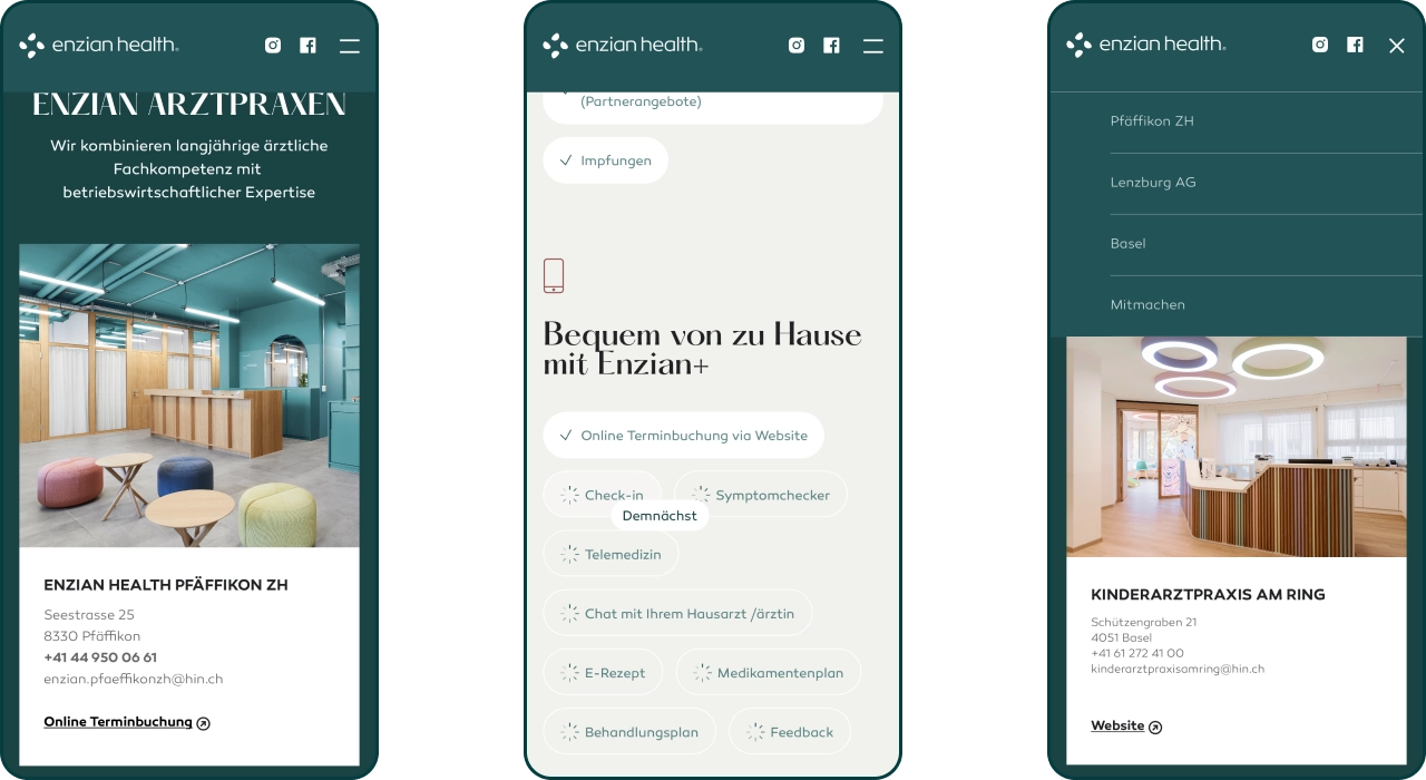
Here, the brand language really comes together and speaks with elegance and brevity, painting a clear picture of who Enzian Health are and what they do, even at a glance.
Leading the user through the synergy of colors, typography and photography, the narrative quickly distinguishes the brand from the competition and shares what services every health center has to offer; leaving the user curious, at the foot of the Health Center Locations section.
Since Enzian Health are growing rapidly, the Locations section is one of the key upgradable elements of the website, currently covering the offerings of Enzian’s health centers in Pfaffikon, Lenzburg, and Basel.
Enzian across the alps: about the clinic pages
Each of Enzian’s health centers offer different specialized and general medical clinics, as well as a variety of more general health and wellness services, depending on the specific needs of the local community they’re embedded in.
This makes the About the Practice (Arztpraxis) page acts as the main page for each health center, showcasing their present and future services. As such, the page puts emphasis on introducing the medical team leading the practice, and covers all their current and future services.
One feature that is particularly unique to these pages is the interactive map found in the Location section of the page.
It displays the clinic’s location on a standard 2D map, but also offers a 3D view that puts the clinic’s location in real-life context with a custom photograph covering a wider area.
This approach shows Enzian Health as a part of the community, and makes the clinic easy to find without any navigation, once one reaches the general area.
Taking time to take care: Appointment booking
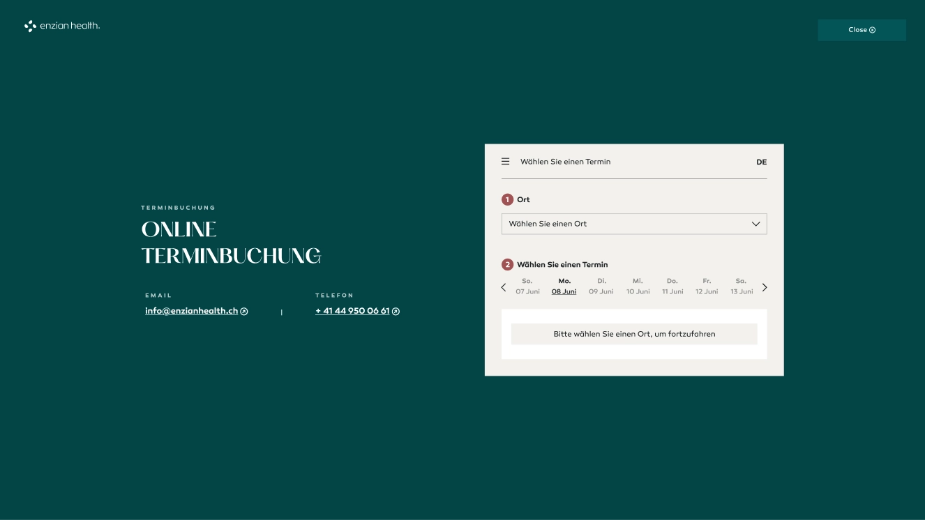
The online appointment booking feature covers all Enzian Health locations, and is available on every clinic’s page.
During its integration, the design of the feature itself received special attention in order to assure it fully reflects the brand and its elegant tone
Living well: Enzian’s Prevention and therapy pages
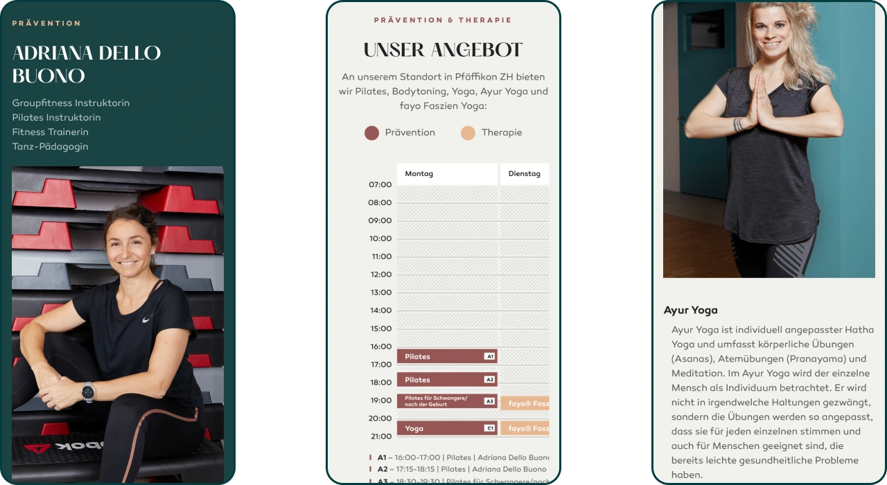
The Prevention and Therapy pages cover medical services such as physical rehabilitation (therapy), pulmonology, and hypnosis, as well as wellness services like yoga and pilates, reflecting the services of each individual clinic.
The design keeps to the brand language with a clean, elegant aesthetic, introducing the practitioners and highlighting their personalities and expertise.
If anything, this page showcases the holistic approach to healthy living that’s at the core of Enzian’s brand values, a sentiment clearly shared by the staff (in this case, Pfäffikon ZH).
We put a special emphasis on the schedule’s design, being that it’s the element users will be interacting most. The secondary colors provided beautiful warm contrasts and added a uniquely “Swiss” look to the elegant aesthetic.
The page is also designed to be future-proof, supporting expansion and different layouts, allowing it to suit future services, while maintaining the character of the brand.
We made the schedule into a modular Figma template that’s fully user-modifiable, so as to serve the client without our assistance. Using our secondary palette to provide the warm, welcoming contrasts, it adds a uniquely “Swiss” look to the elegant aesthetic.
KEEPING UP WITH HEALTH: NEWS ACROSS THE ALPS
Besides the care we took while crafting the brand’s digital expression through UX, UI, and numerous customizations. Additionally, we made sure that Enzian Health had all the SEO and marketing tools they needed to expand the reach of their brand moving forward.
To complete this toolset, we crated the Blog & News page you see before you.
- They also spoke up if they saw things differently./Enzian Health, Co-Founder
Fabian Müller
Co-Founder
Outcome
Since coming to us with just an idea, to launching their brand and website in 2021, we helped Enzian Health (digital health) grow into a rapidly expanding healthcare provider across rural Switzerland, scaling from a single idea to 8 fully operational health clinics, fully bootstrapped.
All outcomes are reported by the Client through a post-project feedback session
Funding
0 to 2500
Idea to 8
- Client:Enzian Health AG
- Timeline: 4 Months
- Sector:
- Industry:Healthcare
- Country:Switzerland
- Services:Competitive AnalysisMarket/Industry analysisUser/Customer analysisBrand positioningCreative DirectionArt DirectionBrand IdentityBrand Tone & VoiceBrand ApplicationPhotography Art DirectionPitch Deck DesignGraphic DesignWeb UX DesignWeb UI DesignWebflow Development