




Kollabo AG

A digital platform determined to bring the future of craftsmanship to SaaS, through true Kollaboration.
Project Overview
Kollabo is a Swiss company that celebrates an honest day’s work by helping companies and craftsmen come together through its digital platform. Their straightforward approach to SaaS means their agents are in direct contact with both craftsmen looking for work and companies looking to hire them.
Matching craftsmen (and craftswomen) with employers from a curated selection of contracting companies, Kollabo’s agents find job placements that fit their client’s skillset, needs, and location, covering a large variety of specialties within the construction industry.
01:02
Play
Challenge
Since the good people of Kollabo make finding work easy for their clients, we agreed to make it easy for their clients to find them.
Once we agreed to design their brand and develop their website, our goal was to make them stand out as professionals, devoted to both their clients and their partners.
In doing so, the main obstacle we faced was the perceived disparity of audiences that we were trying to reach; the construction industry is usually associated with high-stress, short-term engagements that usually favor employers over independent, professional craftsmen.
Approach
Trusting us to keep to our standards, Kollabo gave us full creative control over the project. In turn, we delivered on the promise to eloquently express their operational excellence and bring their brand to the height of their devotion to their clients.
But before we were able to do this, we had to overcome the challenges we faced with effective, clear communication of Kollabo’s values throughout all levels, including the functional and the narrative.
With that, our objectives were clearly defined.
Objective
- ①
Develop a strategy that incorporates the duality of Kollabo’s audience; adapt a modern visual narrative to appeal to both craftsmen and construction companies.
- ②
Make Kollabo stand out for their effectiveness and modern approach, but keep the brand true to their values: simple, honest, and hardworking.
- ③
Design Kollabo’s website with a modern aesthetic for traditional work. Let their company’s character speak in its own voice, garnering and fostering trust with their clients.
Branding
- Logo design
- Color palette
- Typography
- Design system
- Applications
- Digital assets
Designed for business and blue collar alike: Kollabo’s brand celebrates the values behind an honest day’s work
Challenge
Companies and SaaS platforms that are based on outsourcing manual labor are nothing new. However, companies that actually care about building long-lasting relationships with the workers and companies they outsource to are.
With this in mind, our main challenge was creating a visual framework that will showcase Kollabo’s spirit of partnership throughout all levels of engagement. Effectively, we needed to communicate a complete separation from the “work for hire” cliché that’s associated with the construction industry.
Direction
Our approach centered around building on Kollabo’s values and making them stand far above the competition in the best possible light. We needed to design a unique brand aesthetic, backed up by a brand language system that would be memorable to craftsmen and contractors alike, in order to bring them together through Kollabo’s digital platform.
Once the foundation of Kollabo’s brand language was formed, we would needed to form a visual narrative that highlights the potential of collaboration through the use of a simple and efficient digital platform.
Result
As the cornerstone of the band, the logo is a simple shape, slightly stylized to add a modern feel. It reflects the symbolism of a building block, a brick, that calls to collaboration with the aim of accomplishing something of greater value than one can achieve on their own.
This message is also uniquely integrated into the photography, literally framing the visual expression of the brand’s narrative.
The Trim Web and Helvetica typography echoes this message as well, giving a subtle nod to the grit and robustness associated with construction, but it also evokes a sense of reliability and permanence, like a message carved in stone.
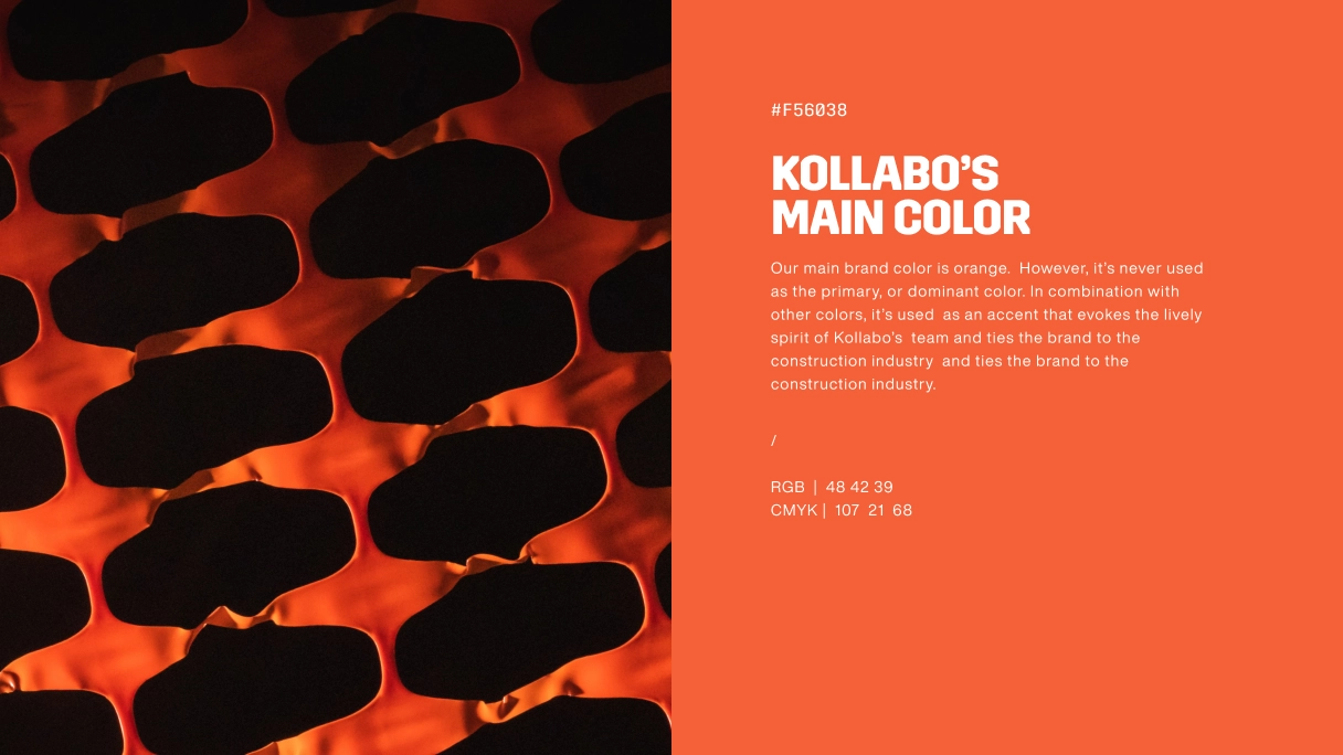
The symbol is an abstract visual representation of a brick, with color and shape connection with orange construction safety net that could be found all over the construction sites.
photography art direction: A portrait of values
Kollabo works with craftsmen from more than 40 different specialties, so we needed to find an approach that clearly depicted each one, while tying together the worker and the work with the Kollabo digital platform.
We accomplished this by elevating the individual craftsman through the visual framework of the brand, using their image as an integral part of Kollabo’s visual identity. This way, the brand itself stayed clearly distinguishable, even at a glance, but not so much that it overshadowed the individual.
This clearly separates Kollabo from the rest of their industry by telling the story of the working man and his craft through a visual narrative unique to their brand.
This approach resulted in a visual hierarchy that fully encapsulates Kollabo’s brand and its character, as can be seen below in the excerpt from the Brand Guidelines.



Make sure to have clear space around the head and keep the environment element as an important part of the photography narrative.
Carefully crop the photo in the shape of the logo symbol, and leave the head untouched: that will be handled in the next step.
Finally, make sure to crop the section of the head outside the shape (no more than ~15% of the shape's height).
Work that speaks for itself: Job Categories
These are some examples of the photos we used for website navigation to depict each of the 40+ job categories that Kollabo offers through their platform.
Straight to the point, simple and intuitive, they showcase each craft with no interpretation necessary, while clearly conveying that the worker comes first.
This “on point, on-brand” approach can also be found in printed branding applications (billboards and posters).
brand Photography: down-to-earth and ready to work
Given that photography was the main visual narrative asset, we expended a great deal of effort crafting a style that was capable of both delivering a strong message and seamlessly transitioning through all branding applications, including the website.
In essence, Kollabo’s brand photography keeps to the same style as defined by the art direction. It ensures that the tone and voice of the brand remain consistent and easily recognizable, while elaborating on composition to suit case-specific themes and applications (as seen in the categories below).




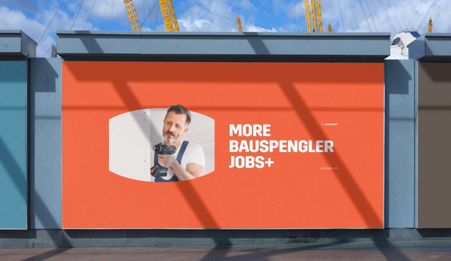
Print: Kollabo’s calling card, in bold
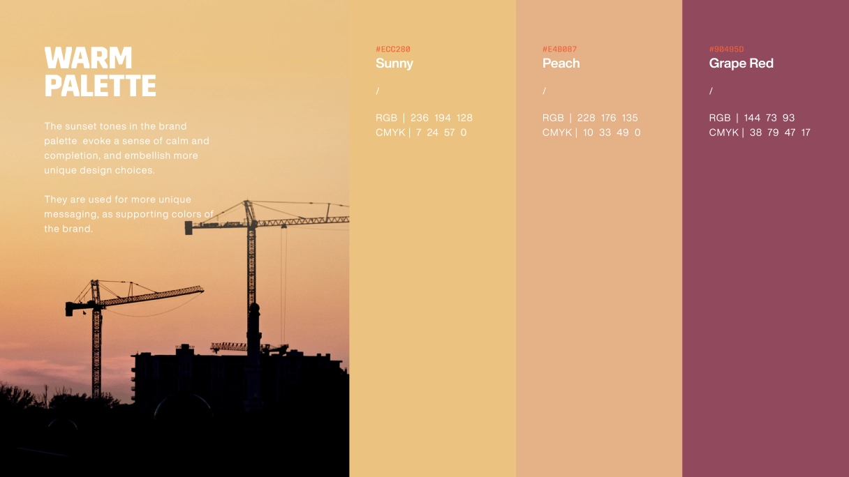
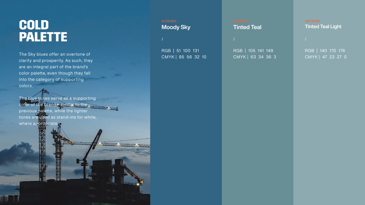
Kollabo’s print brings out the full potential of its brand language as they utilize the full expressive range of the brand’s unique typography and tonal variety available through its color palette.
It sends a strong, clear message, staying firmly grounded in its distinguishable, firm, hands-on style, regardless of print size or context of application.


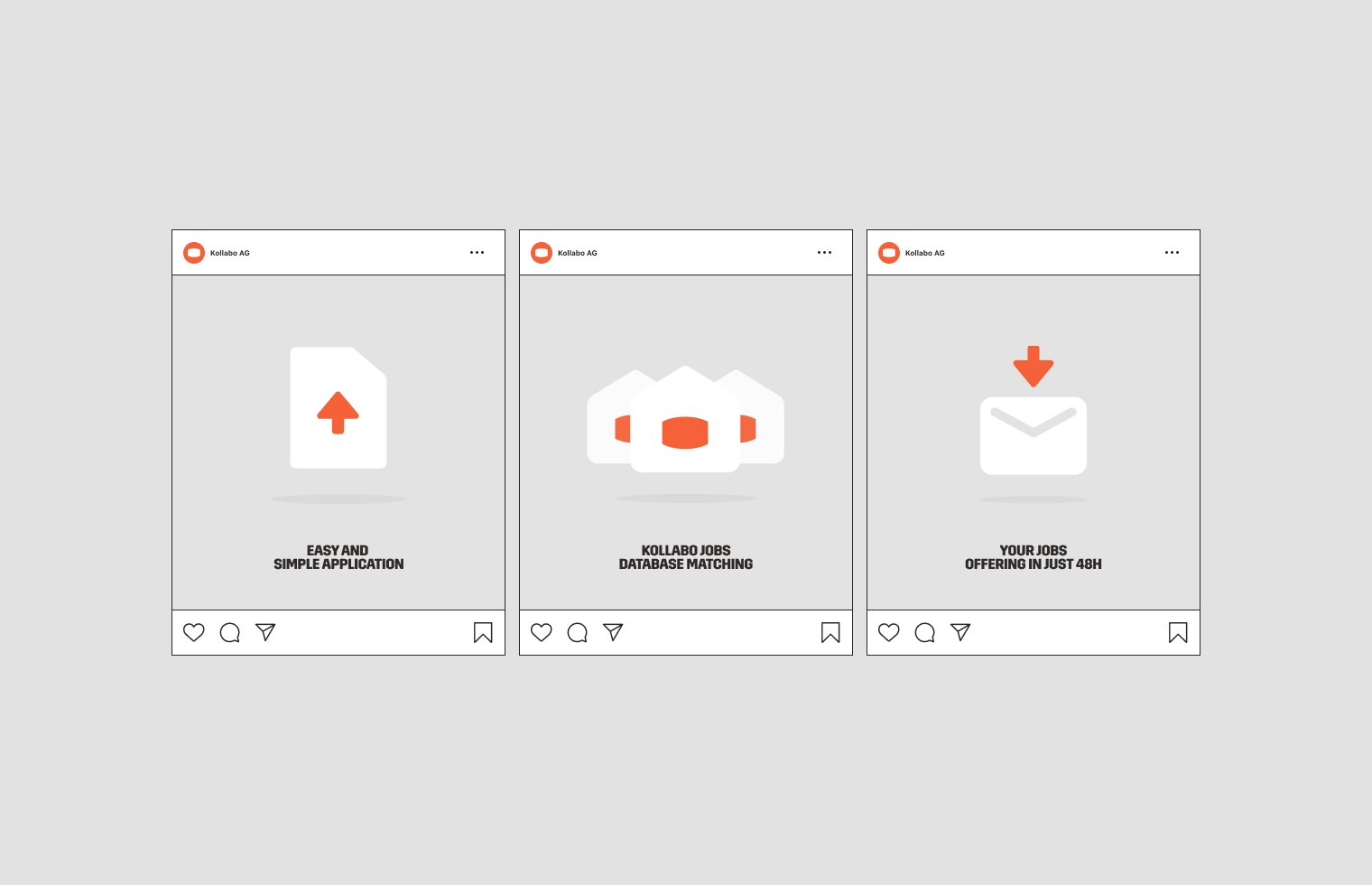
kollabo, Illustrated.
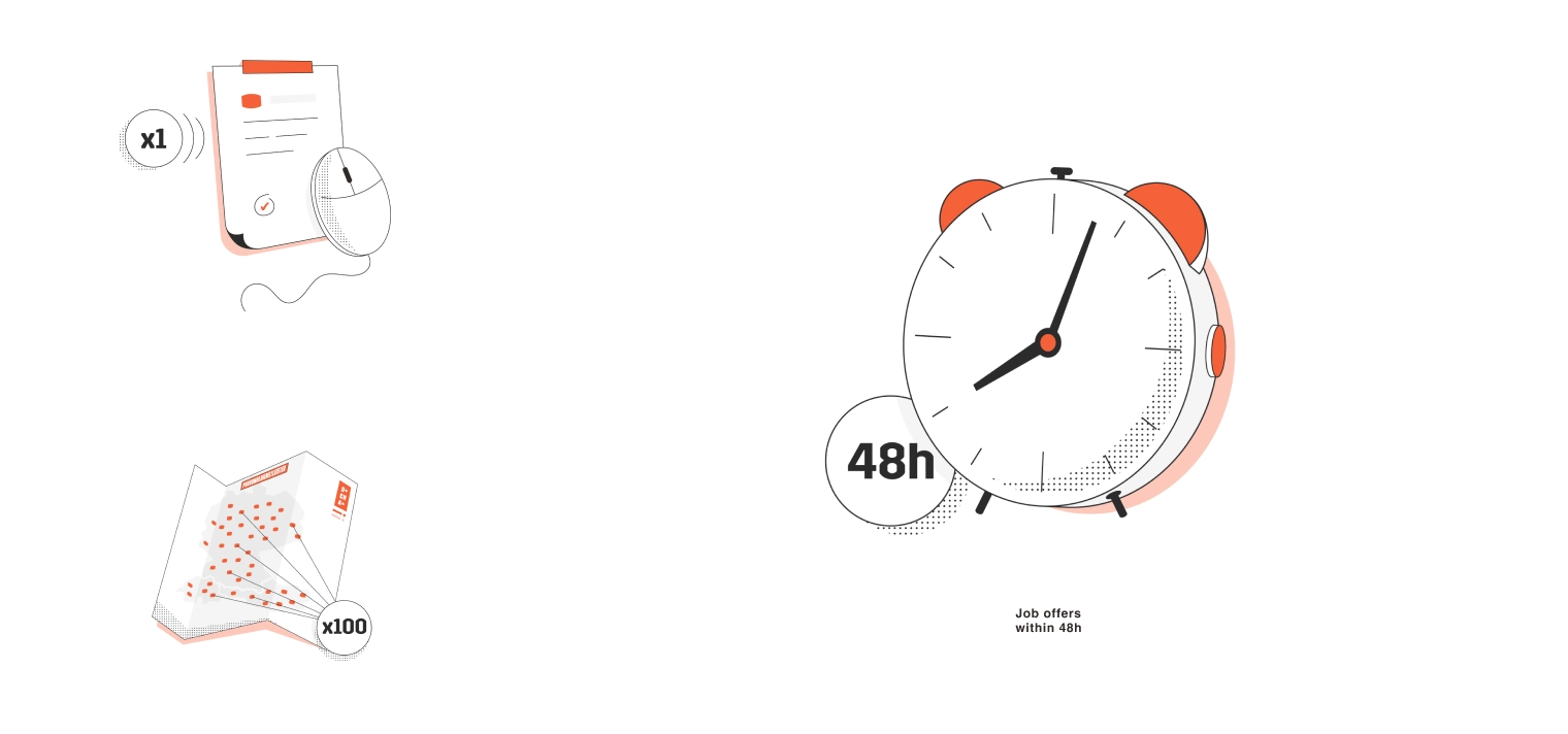
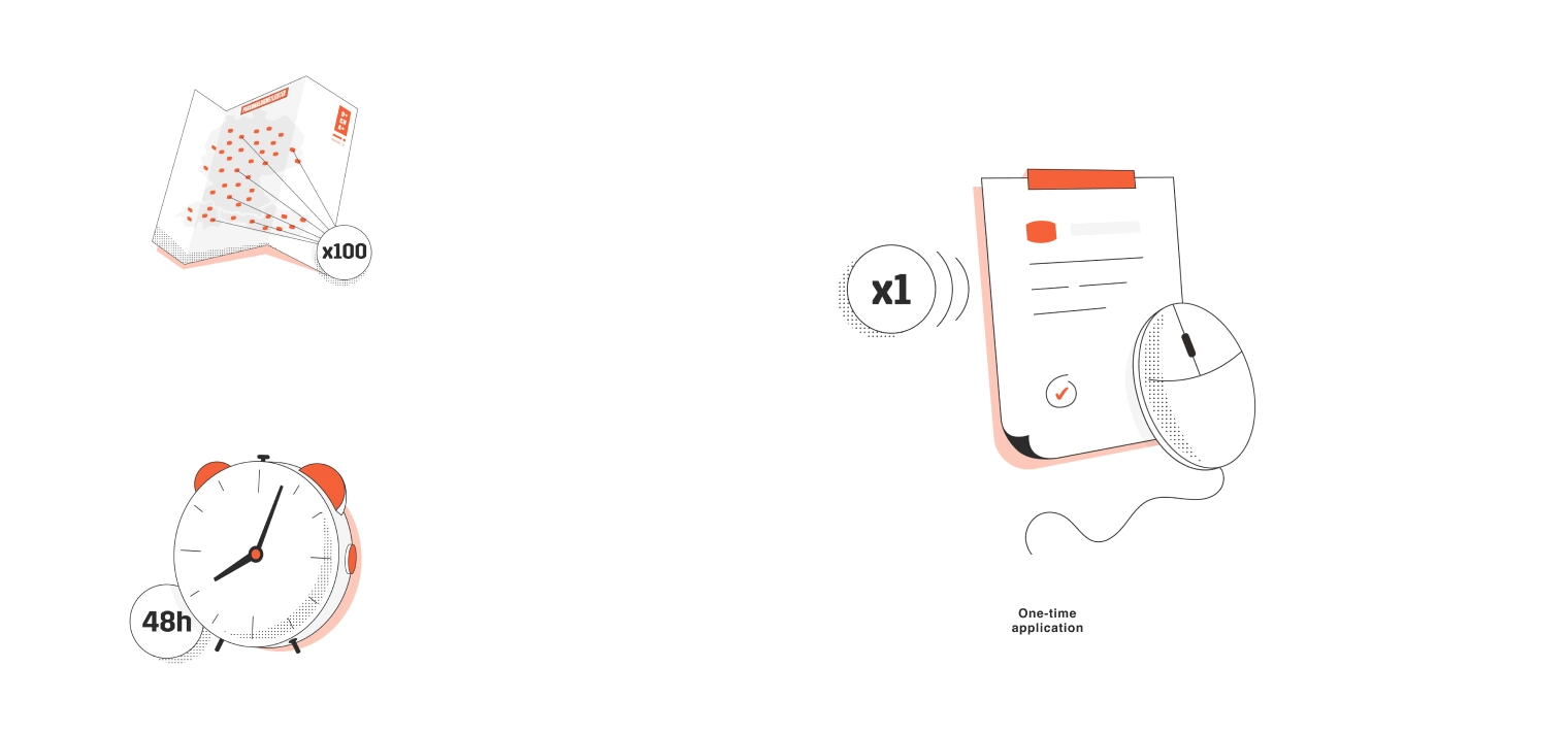
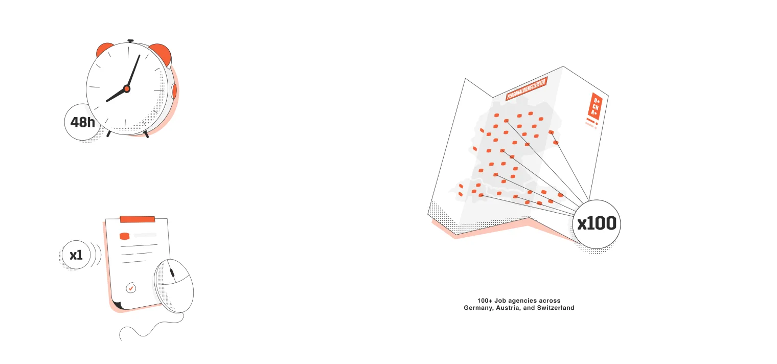
Since the brand required very few illustrated visual assets, we decided to put a unique twist on the ones you see below: simple design, clean aesthetic, and a clear message: hands-on.
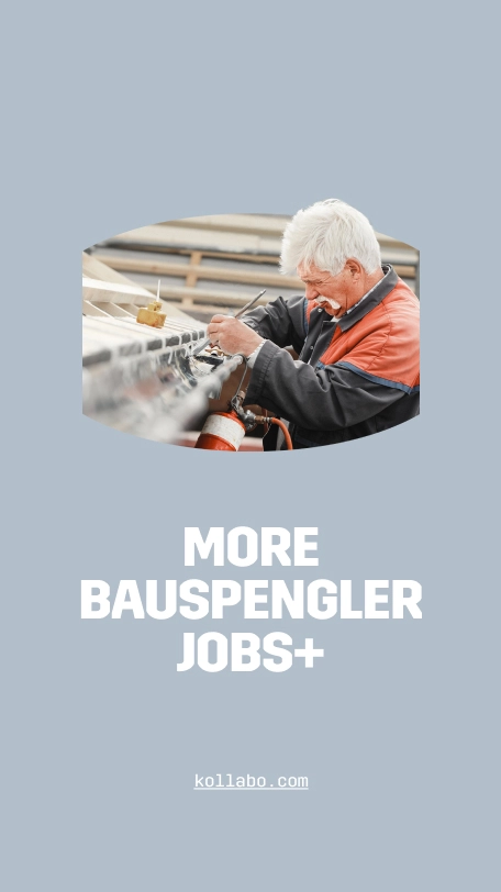
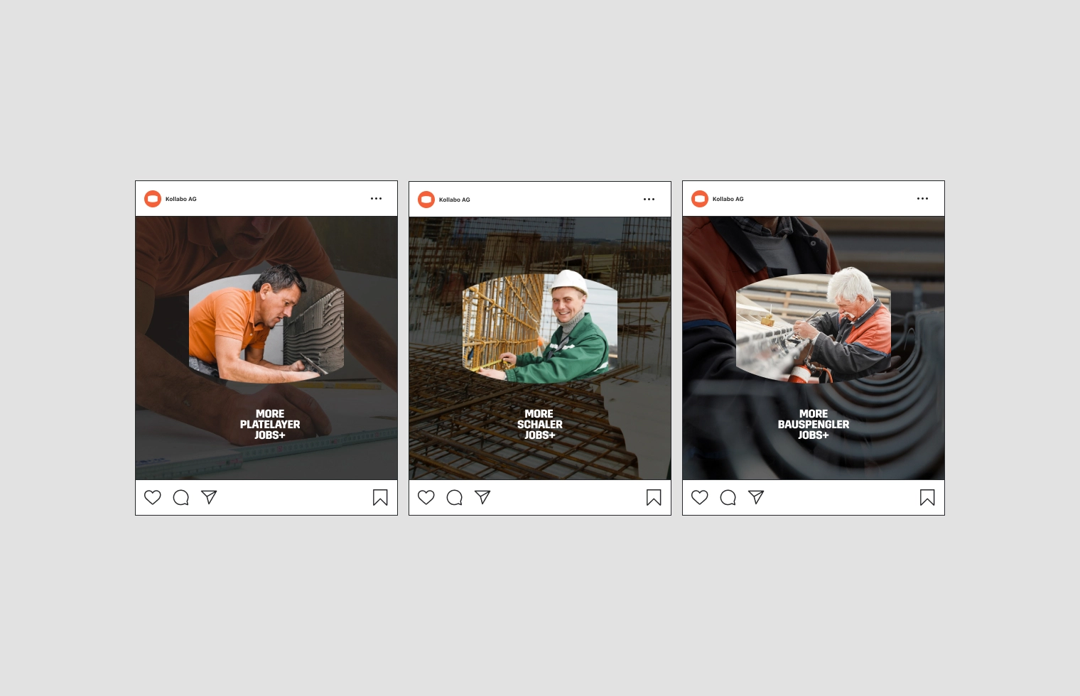
Building better through social KOllaboration: social media kit
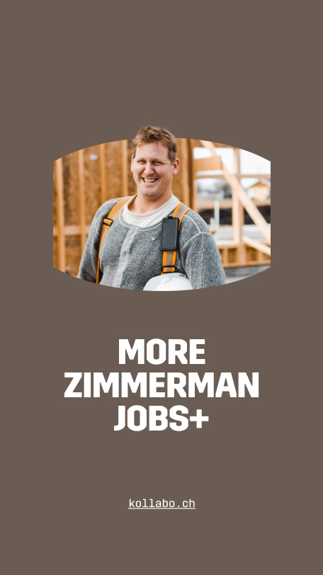
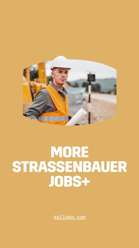
Kollabo’s brand languag4e extends to social media posts as well.
By honing the design to focus on clarity, we provided Kollabo with the tools they need to elevate their brand awareness and increase engagement across all social media platforms.







Kollabo’s new building blocks: brand book
Kollabo’s branding was extensive, essentially covering all conceivable mediums and aspects of application.
In order to avoid any possible misuse that comes with that kind of versatility, Kollabo’s fully documented brand book establishes clear application rules and provides detailed guidelines for branding application.
Detailing Kollabo’s brand system with all its supplementary materials, the brand book allows for easy brand expansion down the line, while preserving the band’s character and visual identity.
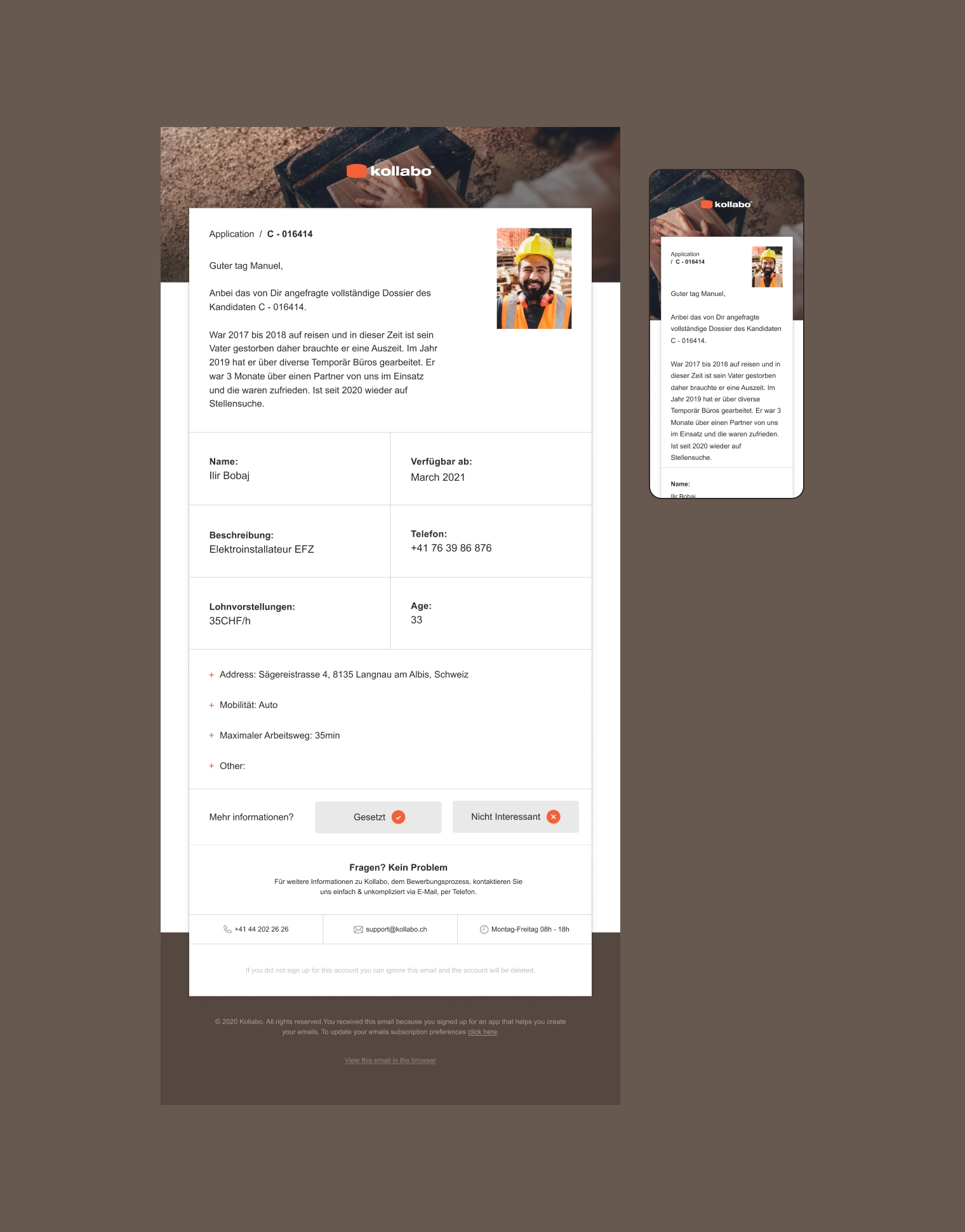
Signed, sealed, and designed: job application forms
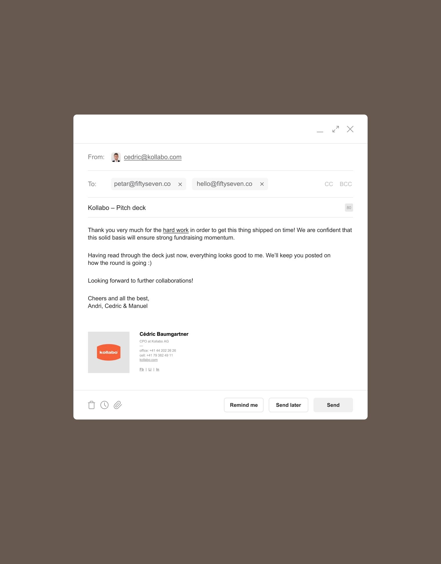
Since Kollabo is a SaaS company in HR tech, we decided to extend their branding to include a custom HTML template for job application forms, complete with unique email signatures.
This final touch ensured the brand’s consistency at every point of contact with the user, bringing the brand experience full circle.
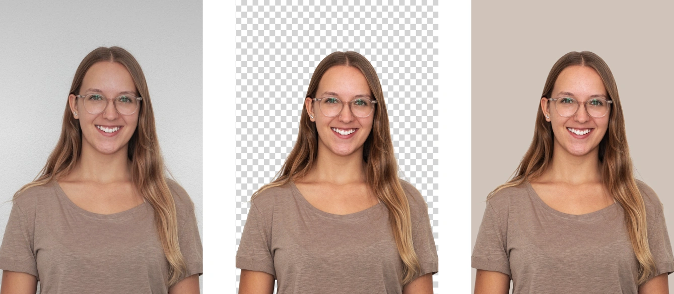
real contact before the contract: photography art direction
A true pleasure, working with Kollabo’s team to determine the photography art direction was a breeze.
With very little input, the direction we provided was executed flawlessly. The colors, lighting, expressions; every creative element was implemented perfectly, down to the smallest details.
The photoshoot resulted in portraits that nest seamlessly into the brand’s aesthetic and clearly communicate Kollabo’s genuine down-to-earth, people-oriented character.


Website
- Web UX
- Web UI
- Interactions
- Editorial
- Web development
An intuitive design: speaking clearly to both craftsmen and companies, in the spirit of true Kollaboration.
Challenge
Kollabo’s website needed to bring its audience together through shared values and reliable partnerships throughout Germany and Switzerland, across more than 40 specializations.
This makes the challenge obvious: one platform needed to appeal to a broad spectrum of people from very different walks of life, and function flawlessly across all layouts.
This meant that the design needed to elegantly handle a large variety of incoming and outgoing information, while keeping with the brand’s character and aesthetic.
From a development standpoint, the website itself had to be rock-solid and easily scalable to accommodate exponential growth.
Direction
To ensure the stability of the website and provide a frictionless experience for all users, we sat down with Kollabo to work out how we can make the application process simple and consistent.
Our solution constituted a clearly visible path that seamlessly leads the user through the pages, the job listings, and finally, to a simple job application form.
We were thorough, making sure that no important information gets overlooked along the way, but we also stressed the importance of making the experience as visually intuitive as possible.
Result
Paying special attention to the job application form (our main CTA) and the region-specific job pages with their respective document submissions, we created a web experience that elevates Kollabo’s brand far above the competition.
Kollabo’s brand language played a crucial role in helping us accomplish this.
The tone and voice of the brand spoke with a distinct, strong character that naturally lended itself to effective, streamlined design, showcasing Kollabo’s integrity with its crisp typography.
In tandem with the photography assets, the robust language of Kollabo’s brand removed almost any need for complexity and allowed us to clearly communicate their message through the clean, modern aesthetic.
A simple expression of integrity: website UI design
Greeting the user with a modern aesthetic and a background video in the hero section, Kollabo’s brand narrative makes a strong first impression on the landing page.
The design establishes direct contact with the user, opening a clear line of visual communication that persists throughout the various sections of the website.
All elements of the layout speak clearly and intuitively to their purpose, ensuring that the user never feels uncertain as to where they are, or where to go next.
In-tune with Kollabo’s brand strategy and echoing their business approach, this design solution makes it abundantly clear that the user is no more than a few steps away from a job opportunity, at any given point on the website.
leading by intuition: from job category to application form
The Job Category page showcases the clarity of the brand language we’ve developed in the branding stage of the project, serving as a highly intuitive, visual representation of Kollabo’s job categories.
This design solution isn’t lost for words: it just doesn’t need them.
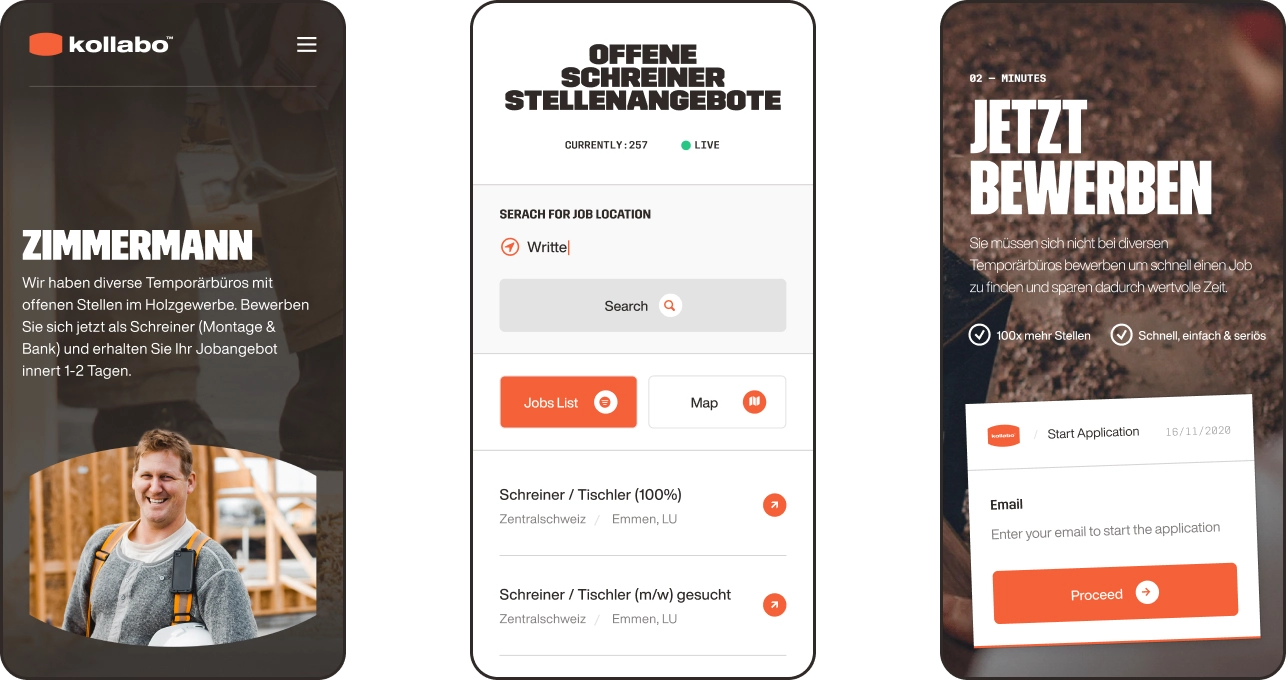
YOU are Where the jobs are: Kollabo’s jobs page
The Job Category page is the perfect showcase for the brand language we’ve developed. The design eloquently balances clarity and intuitive progression, gracefully managing abundant information and ensuring users effortlessly navigate, and absorb, the content.
In terms of functionality, the heart of this page resides in the interactive job posting map that lists available job openings specific to a user’s region, tailored to fit the user’s preference once they’ve signed up on the platform.
From an aesthetic standpoint, it’s worth noting that Kollabo’s brand language is used to preserve visual narrative consistency throughout the job category pages.
For example, the Hero sections of individual job category pages incorporate a background image, chosen to provide wider context for the image that’s used to represent the job category itself.
straight to the point: kollabo’s Job posts page
To ensure a seamless transition from the visual narrative to the crucial text-based information in job postings, we adopted a minimalistic design for the job description pages.
Maintaining visual consistency, we limited the brand language to typography, creating a clean, streamlined aesthetic that culminates in the primary CTA: the job application form.
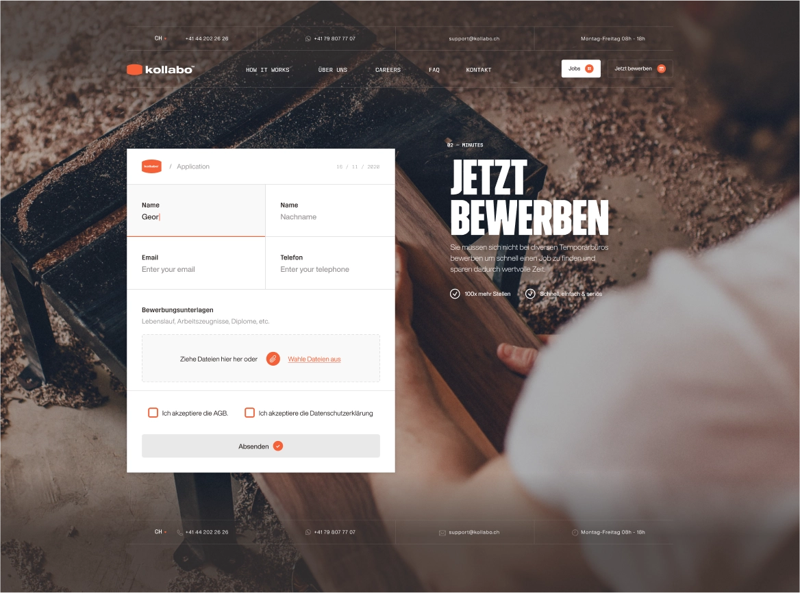
UX Design: an Application of kollaboration
Kollabo’s thoughtfully designed Application Form enables users to swiftly input the necessary information and immediately be assigned a Kollabo agent upon submission, no additional steps required.
After submitting their application, a Kollabo agent reaches out to assist in crafting a tailored profile that aligns with the user's profession and work preferences, such as travel distance and working hours. Once finalized, the user begins receiving job offers that precisely match their set criteria.
the Big, bold, and beautiful: KOllabo about page
We designed the About page to break away from the uniformity of the other pages on the website.
Using the full expressive potential of the brand language, we made sure it conveys the confidence of Kollabo’s character and makes a big, bold impression on the user.
In the Hero section, as users scroll down, the design of the hero section dynamically morphs into Kollabo's brand symbol, allowing the brand to speak for itself.
Finally, we let the typography have its say in the editorial section, showcasing the full power its bold, untamed beauty.
kollaboration: how it works
This page is an interactive roadmap that provides an overview of the inner-workings of the Kollabo platform to potential users.
After covering the steps of the onboarding process, the interactive narrative continues, giving the prospective user an idea of what to expect when they sign-up.
The page concludes with the bottom CTA, encouraging the user to explore the vast selection of jobs through Kollabo’s job categories and invites them to sign-up for Kollabo’s platform.
- I was most impressed by their aspiration to create extraordinary designs./Kollabo AG, Co-Founder & CEO
Manuel Inauen
Co-Founder & CEO
Outcome
Since the launch of Kollabo’s new website and branding, they drastically expanded their user base and immensely increased their company value (+500%). Growing their social media following on LinkedIn and winning various awards, they secured $2.6M funding for further expansion across Europe, beyond Switzerland and Germany. Today, Kollabo are well on their way to become the leading platform for skilled blue collar workers in Europe.
$2.6M
500%
30%
40%
300%
2x
- Client:KollaboAG
- Timeline: 5 Months
- Industry:HR Digital Platform (SaaS)
- Country:Switzerland
- Services:Competitive AnalysisCreative DirectionArt DirectionBrand IdentityBrand Tone & VoiceBrand ApplicationPhotography Art DirectionDesign SystemPitch Deck DesignGraphic DesignIllustrationVideo & MotionWeb UX DesignWeb UI DesignWeb Development