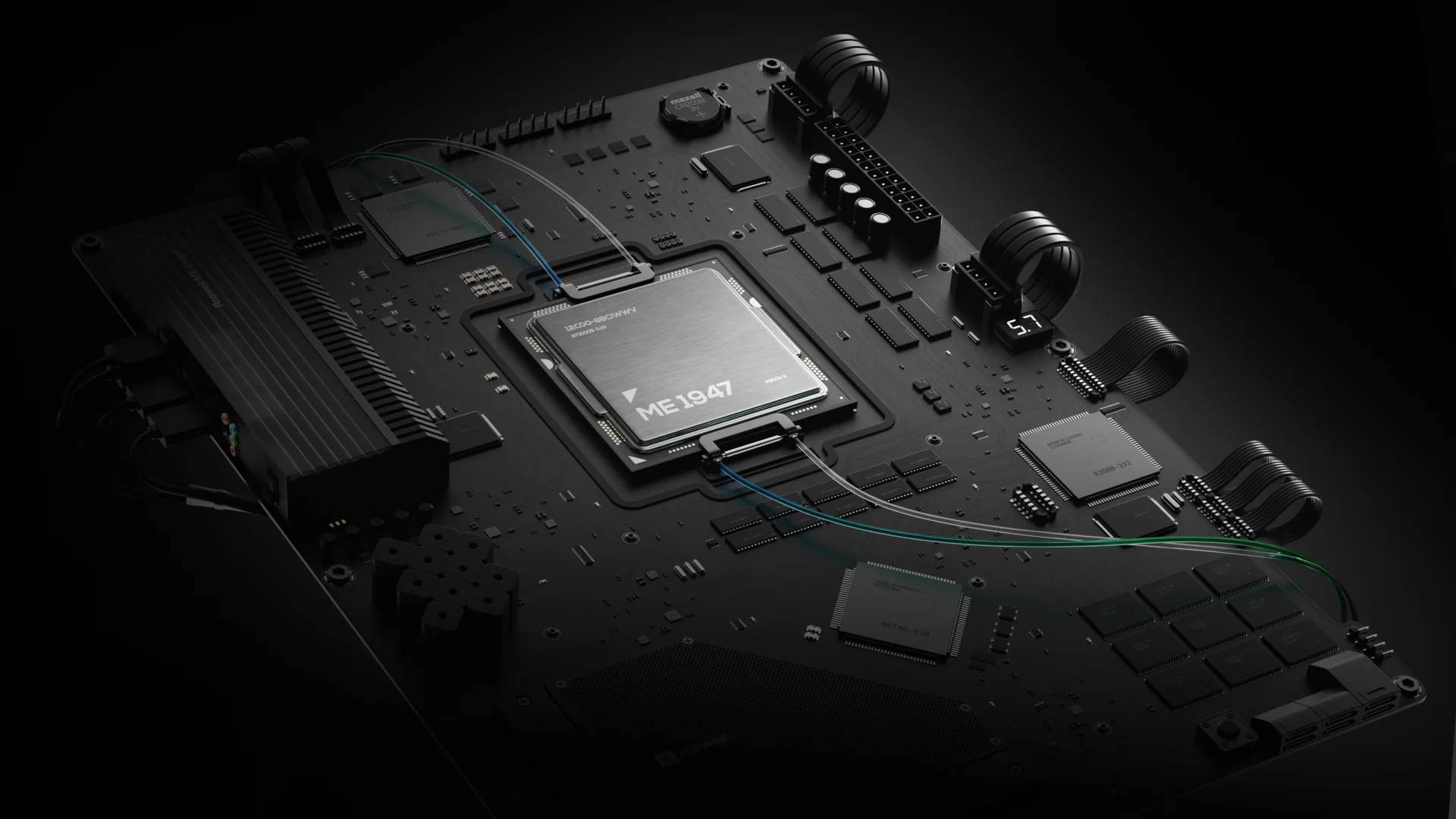




- Country: Switzerland
- Timeline: 4 Months
- Industry: Climate technology
- Sector: Climate Tech & Cleantech
- Service(s):16
DePoly SA
Enhanced recycling comes full circle: a revolutionary climate technology from the heart of Switzerland.
Project Overview
DePoly’s groundbreaking technology has been proven to increase recycling yield up to 99% for all forms of PET plastics, without any sorting or preparation, all at room temperature.
Their ambition is to finally move the recycling industry away from a mostly linear waste management strategy. Drastically decreasing the number of landfills and incinerator emissions, scaling DePoly’s proven technology is the foundation for sustainable full-circle recycling.
00:58
Play
Challenge
The recycling industry has been around the marketing circuit for decades, which meant that breaking away from the standardized messaging was both difficult and dangerous.
But, since we were going to do it anyway, our main challenge was to find the perfect ratio of unique and familiar. This balance was crucial for communicating the prospects of DePoly’s technology, as overstating its novelty could be a major detriment to potential investors.
Approach
Elevate the client’s brand to the level of their technology, focusing on its impact, not its novelty.
Our approach was founded on designing the correct visual and narrative balance between “technologically advanced” and “familiarly approachable.” This balance would allow DePoly (climate tech) to stand out in their industry while still being a part of it, while calling attention to the devastating environmental impact of modern recycling practices, without taking a judgmental stance.
Objective
- ①
Avoid branding cliches associated with the recycling industry, such as curved lines, arrows, vivid colors.
- ②
Create a style of visual expression, such that so that the visuals alone can embody the clean and sophisticated character that embodies the client’s mission and approach.
- ③
Elevate the idea and technology behind enhanced recycling by educating the user, emphasizing it in contrast to current industry practices that damage the environment (problem - solution).
- ④
Create an authentic story creatively depicting DePoly’s technology in a way that’s easy to comprehend and does not require expertise in their field.
- ⑤
Establish branding and website aesthetics that integrate a sense of confidence and trust toward DePoly and their technology.
- ⑥
Focus on elegance in design, reflecting DePoly’s mission and confidence, so that it resonates with in the main CTA (ordering a sample for independent laboratory evaluation of the effectiveness of their new technology).
Branding
- Logo redesign
- Iconography
- Photography
- System
- Applications
- Social media
Standing out, not standing outside: straightforward design at the heart of an emerging cyclical industry.
Challenge
Our greatest challenge was finding a way to make DePoly stand out for its approach and technology, without leaving the impression of coming from a different industry.
To do this, we dismissed all recycling branding clichés, and designed the brand like DePoly and their technology are the new standard for the industry.
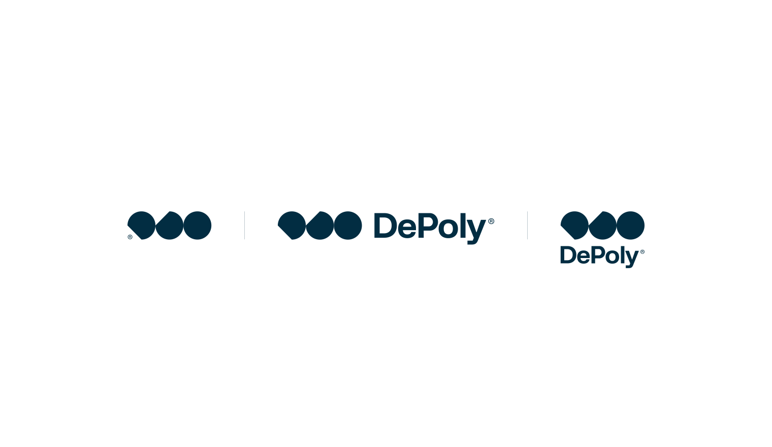
This approach is most evident in the stark difference between their 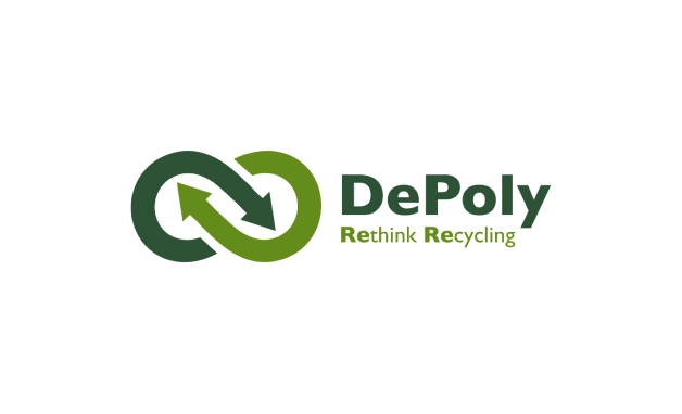 old and new logos.
Direction
Our strategy was based on making the branding properly align with DePoly’s business strategy and elevating their visual identity to the height of their expertise: streamlined, elegant design.
This crystalized into a clean and non-invasive look, with direct and sophisticated brand language. Using a dignified, earthy color palette, this aesthetic speaks to the refinement of the client’s technology and evokes a sense of connection to nature.
Result
Best evident in the logo, the branding narrative follows the cyclical constructive/deconstructive process of enhanced recycling. Supported by a clean aesthetic, this process is depicted in the visual abstraction of three plastic particles (left to right, right to left), doing away with the traditions of the industry, such as curved arrows and the standard blue/green colors.
However, at the core of DePoly’s visual messaging visibility is its brand language system, scalable across all mediums.
DePoly’s new logo differentiates them from the rest of their industry by moving away from the curves and arrows associated with most recycling brands, like the ones found in their old logo above.
-uses-seo-optimization-fiftyseven-design-studio.svg)
all the colors of circular recycling
As we’ve previously established, our approach was to set DePoly apart from their competition, but not so much as to remove all association with their industry.
- Beige, Crema, and Denim.
These are used for every brand asset we have: Denim for text, Crema for backgrounds, and Beige for certain brand shapes.
- Pastel Yellow Lime.
We used this one for highlights: important messages and copy, buttons, and similar elements that need more attention.
- Tones of Pastel Blue and Green.
These were used as soft background colors. Supporting various brand assets by adding depth and variety, these colors allow for easier discernment.
Technical, not typical: iconography
In keeping with our strategy to make DePoly’s branding stand out, yet stay connected with the recycling industry, we intentionally created a sub-style of industrial iconography that closely resembles traditional informative labeling for industrial applications and products, such as textile labels and technical manuals.
This style of branding and physical labeling is an intentional callback to the clean and precise nature of their technological process, but also serves a practical purpose in presenting specific, technical aspects of their business and messaging.
Enhancing recycling with an enhanced technical typeface
We based our typography choices on the idea that it had to resonate with the elegance of DePoly’s technology while also delineating the scientific foundation of their business.
FK Grotesk is our main typeface, as it perfectly captures the nobility of DePoly’s mission, while also encompassing the elegance of a Swiss product.
Our supporting typeface, FK Grotesk MONO, represents the technical aspect of DePoly’s brand, providing a means to incorporate their expertise in the hard sciences into the brand language.
The MONO font is used for tags, numbers and other technical aspects of messaging.
Icons and typography in use
Staying focused on the solution: photography art direction
As a part of DePoly’s branding, we also included photography art direction for their social media campaigns, blog posts, as well as any potential pages they may decide to add to their website.
This way, we enabled them to expand their content independently from us, while assuring they had the guidelines necessary to do so, without diverging from the main attributes of the brand’s style, look and feel (pastel, calm, clean, clear).
A dynamic solution to enhanced recycling: the brand LANGUAGE grid system
Our approach to DePoly’s brand language is most evident in the Brand Language Grid System we created to ensure that all brand communication stays clear and in line with the established style.
This system is absolutely essential. It practically imposes message clarity and brand perception unity but it also eliminates clutter, regardless of visual asset or medium use case (social media posts, posters, ads, videos, or any other form of marketing content).
Even though this system focuses more on content ratio and positioning, the explicit rules we’ve created, in concert with typography and the unorthodox colors, ensure DePoly’s brand is unique in its expression and easily recognizable, as well as aesthetically elevated. Simultaneously, it maintains the sense of precision and technical sophistication that’s at the core of their technology.
Legend with sample instructions:
1. Largest section: designated for copy/text, the message.
2. Side section: only for supporting visual asset(s) (3D or photography).
3. Smallest section(s): designated for website address or tag information.
Routing recycling: brand guidelines
As we’ve mentioned, the brand language grid system is at the core of the brand guidelines. Here, we’ll take a look at what that means when applied to the most common use cases.
One system, one logo: all print mediums
This is where the importance of brand consistency really shines through.
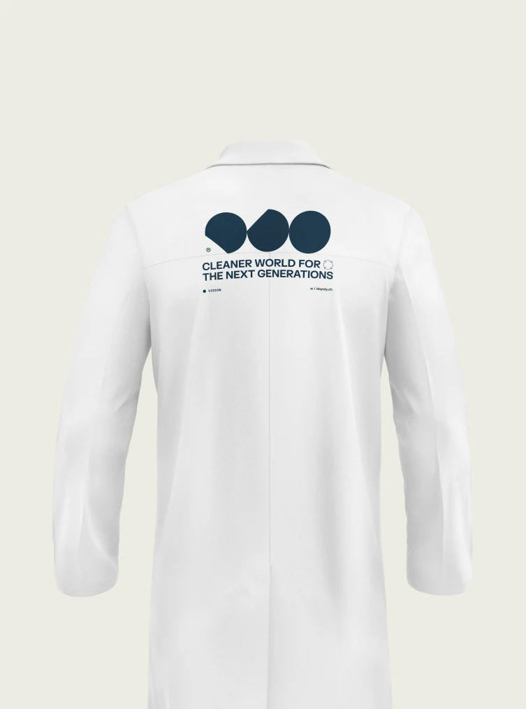
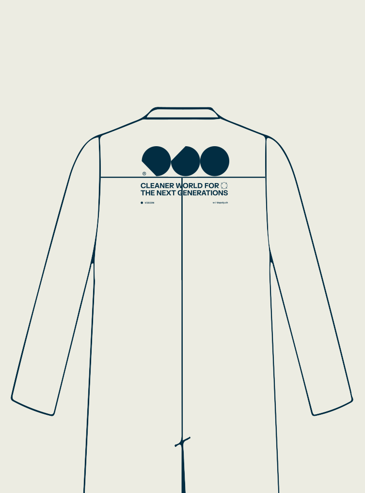
Every application serves a different audience in its specific context, ranging from intimate (e.g. pen or water bottle) or professional (e.g. business card, letter or lab coat), to fully public and social (e.g billboard or social media post).
With this in mind, it is crucial to have at least one element that’s common across all applications in order to establish a common theme and give the audience something to latch onto; this makes the brand’s character distinguishable no matter the context of its application.
DePoly’s brand has three such elements, touchpoints, across all applications.
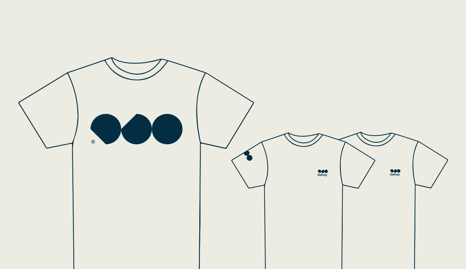
The elements of the logo constitute the main framework for all visual assets: that’s touchpoint number one.
We kept the logo essentially the same through out all the print: touchpoint two.
Finally, we employed the branding language system throughout all the applications: that’s three.
Add to that the color palette and photography direction consistency, and we can safely say that we’ve ensured the brand’s character is distinguishable no matter the context of its application.
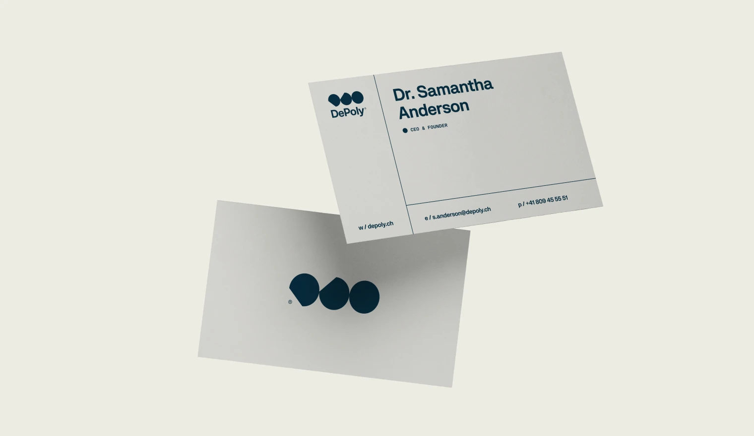
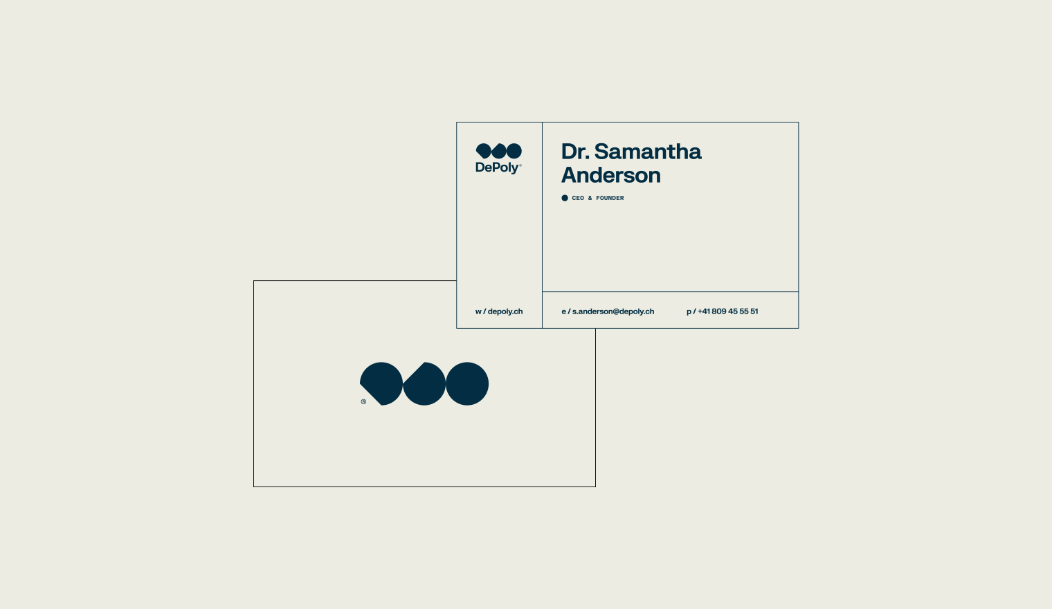
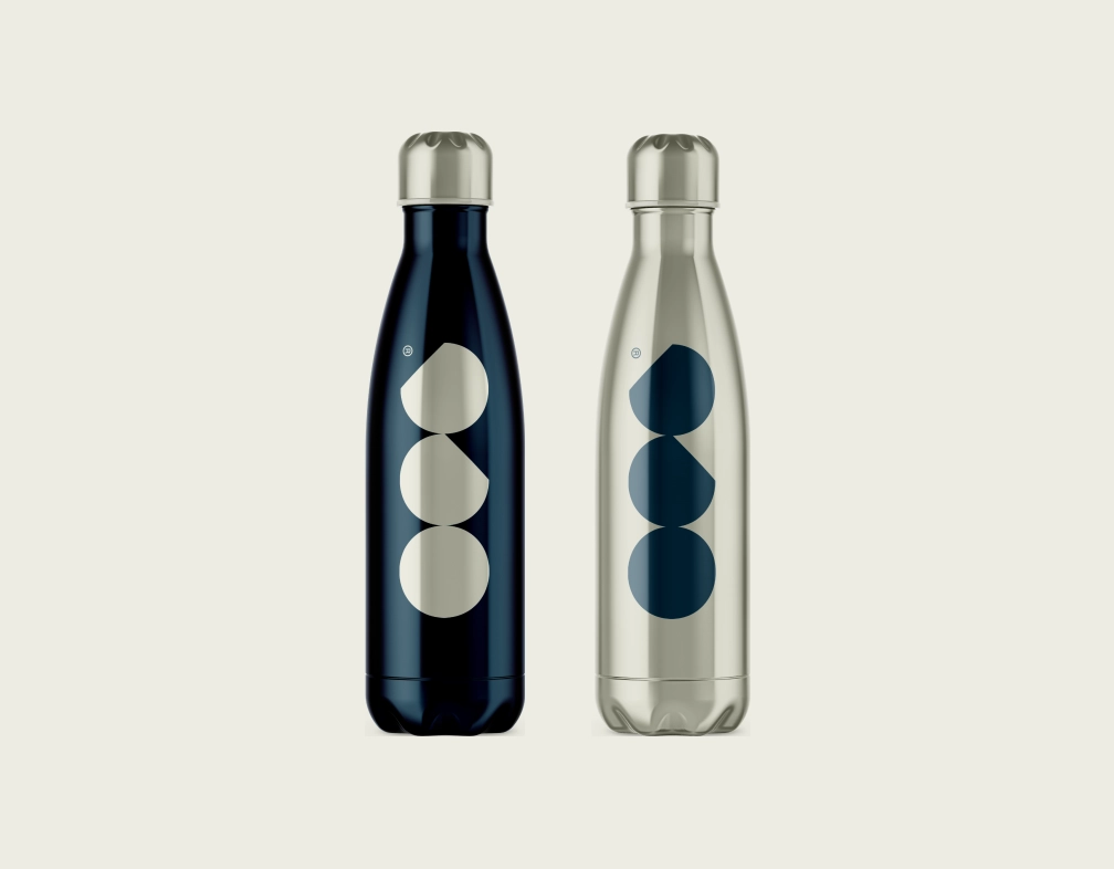
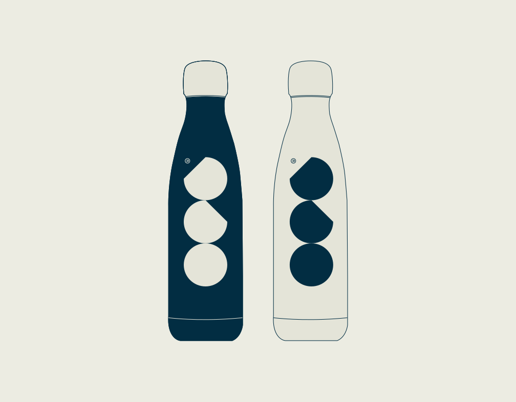
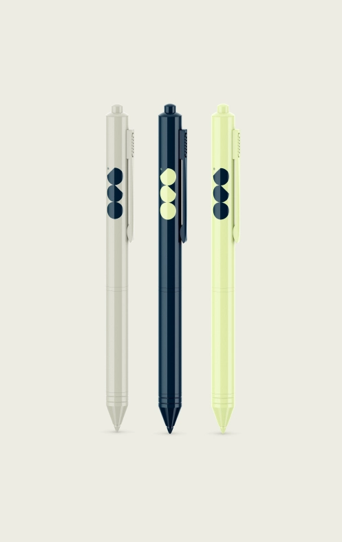

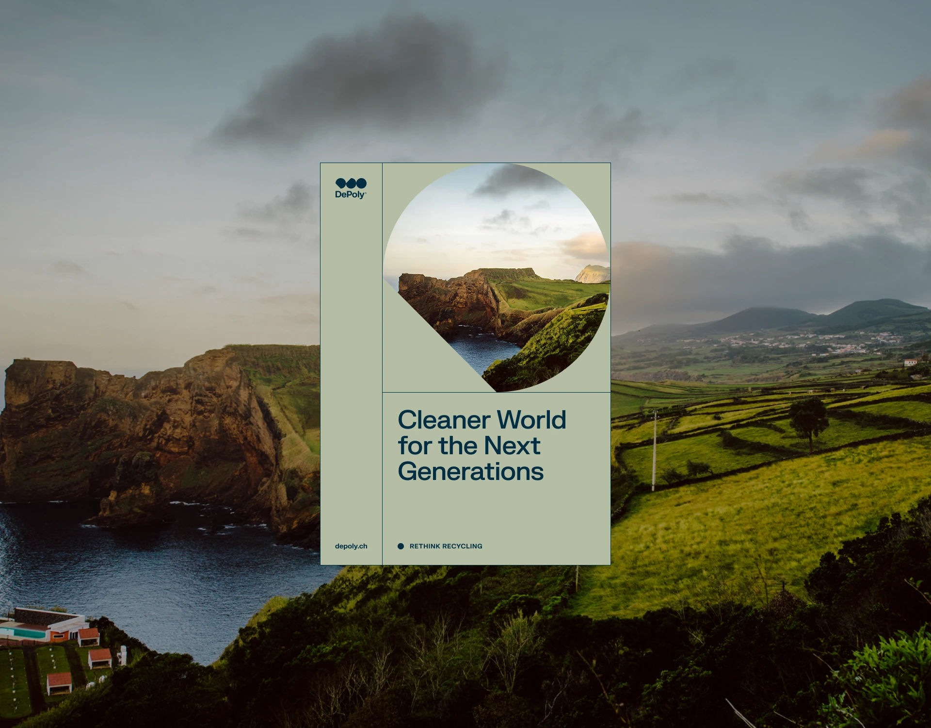
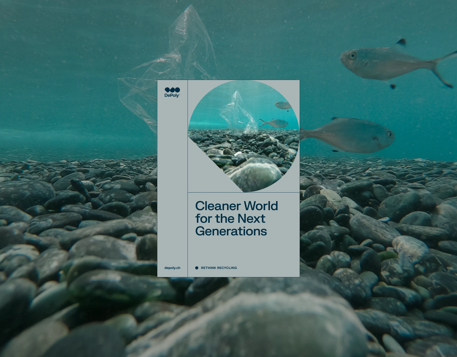
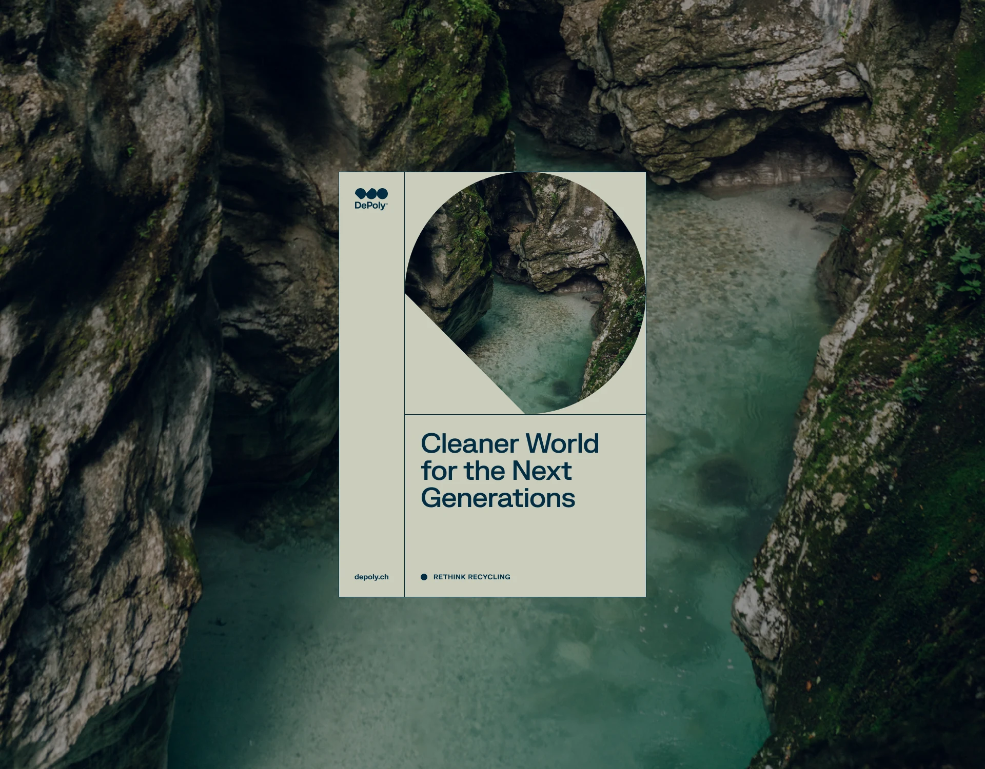
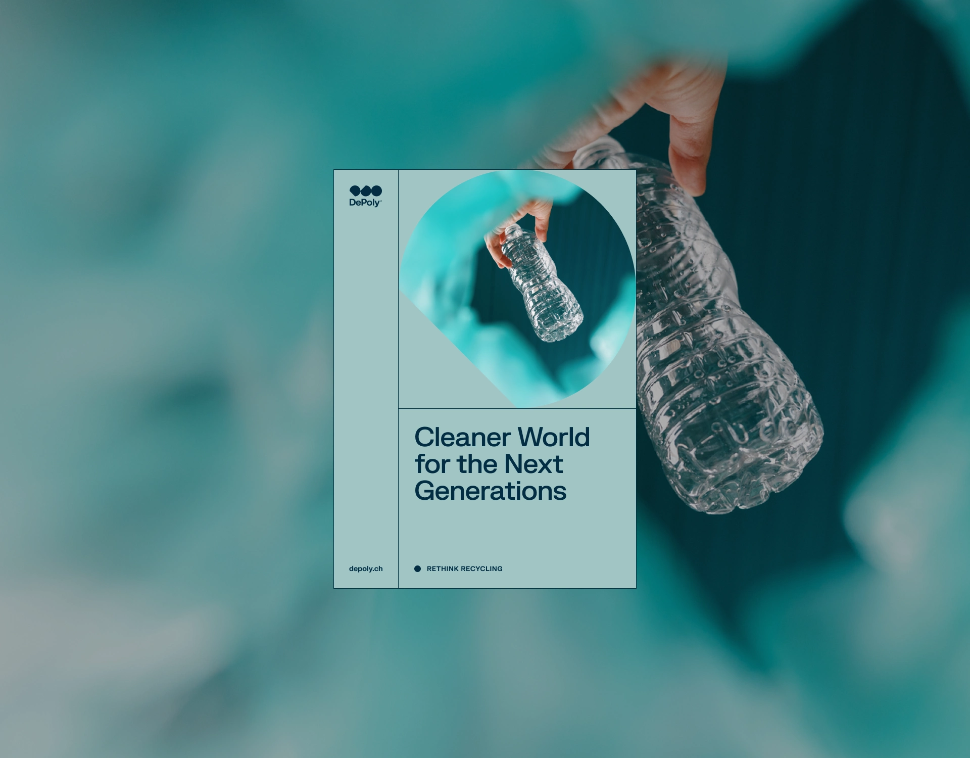
Example of brand language system consistency across all of DePoly’s print mediums.
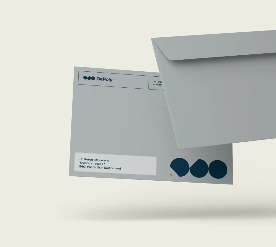
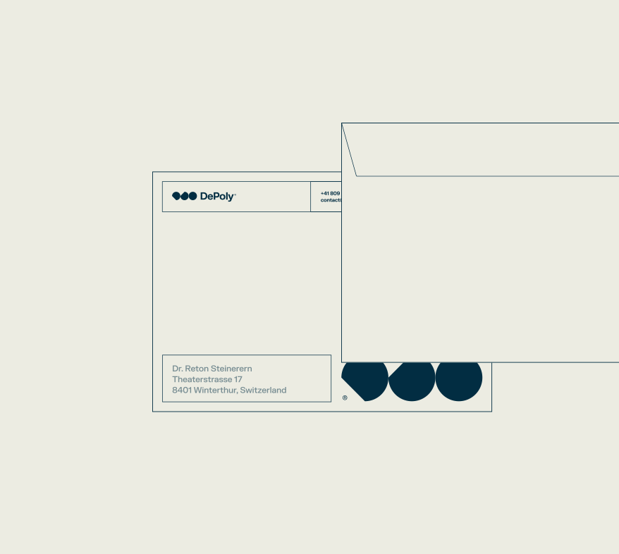
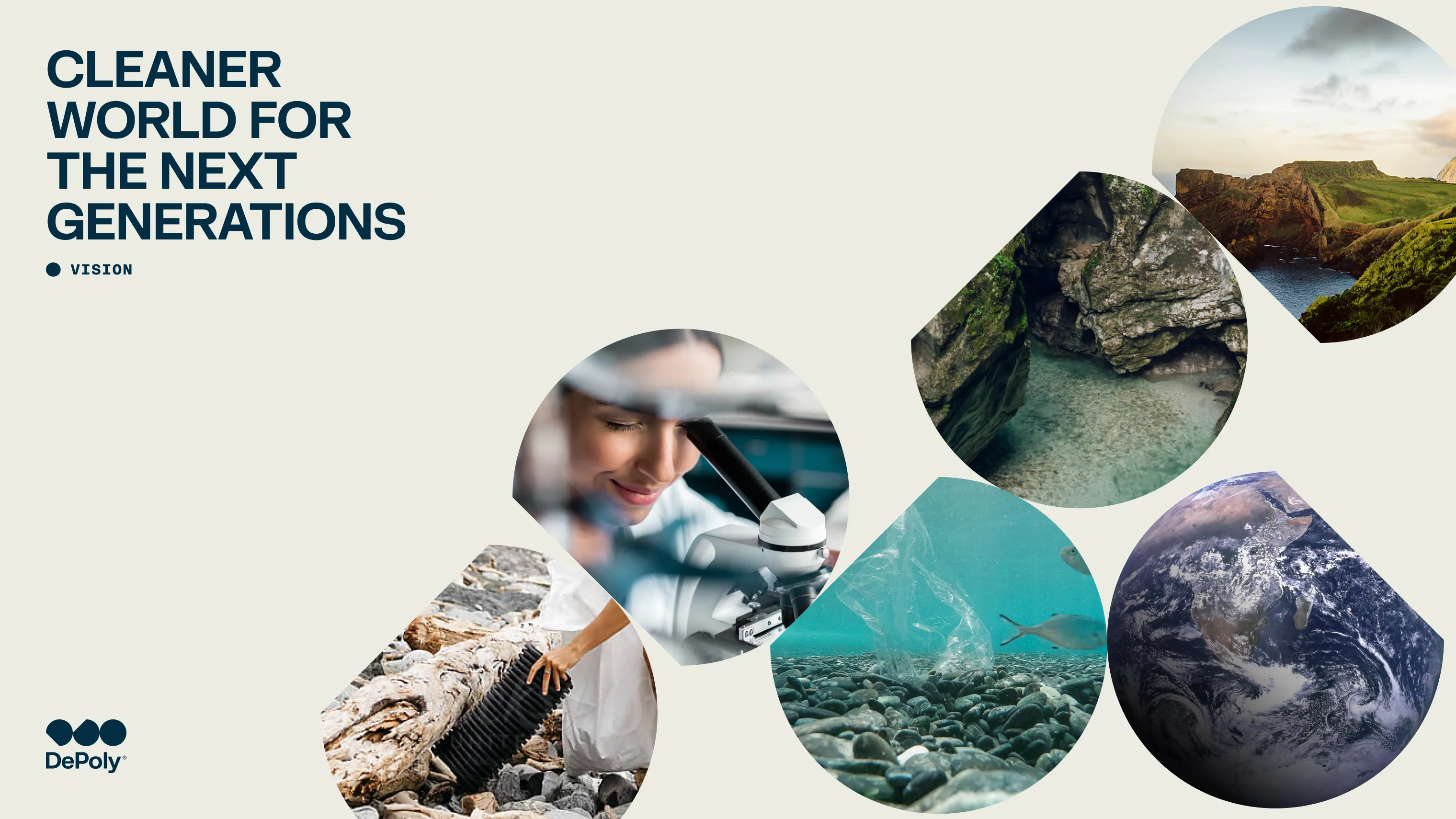
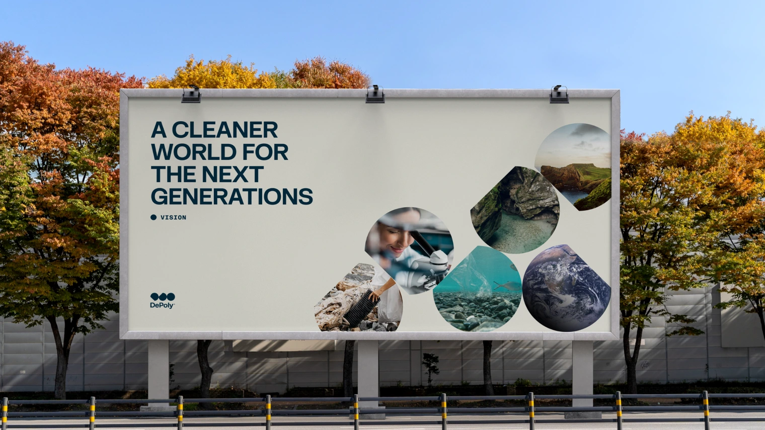
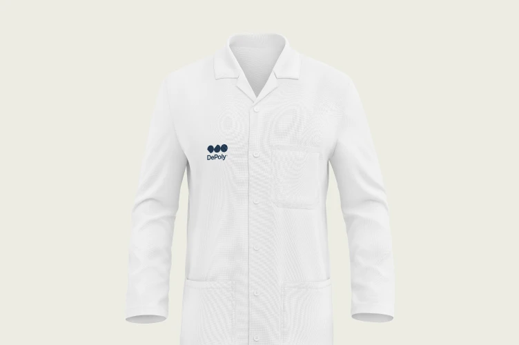
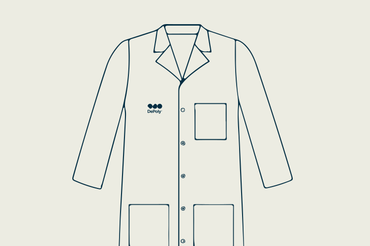
-uses-seo-optimization-fiftyseven-design-studio.webp)
Socializing with enhanced recycling: social media kit
Now that we've established how the three touchpoints (the logo, its visual framework elements, and the brand language system) work in tandem to enhance brand consistency in print, let's introduce custom icons and evaluate the branding's appearance and functionality on social media platforms.
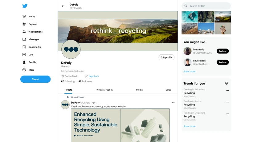
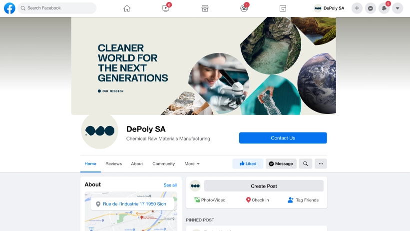
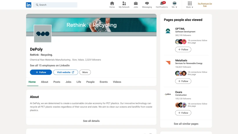
Layout, laid out: TW, Fb, li 2022
Layout, in context.
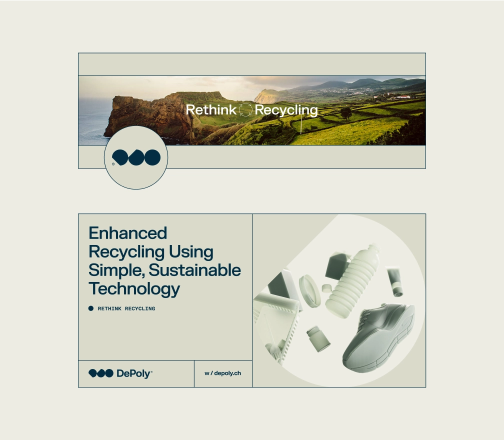
Banners incorporate icons with the logo symbol elements, coming together in a simplified, more streamlined application of the branding system. These are very effective at setting the overall tone of the page, even though they slightly deviate form the layout guidelines.
The posts themselves follow the same guidelines of the branding system as print.
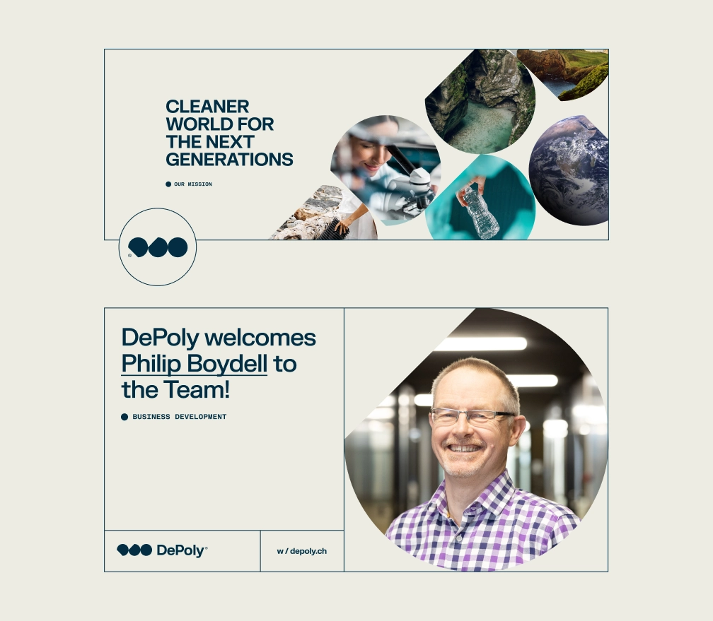
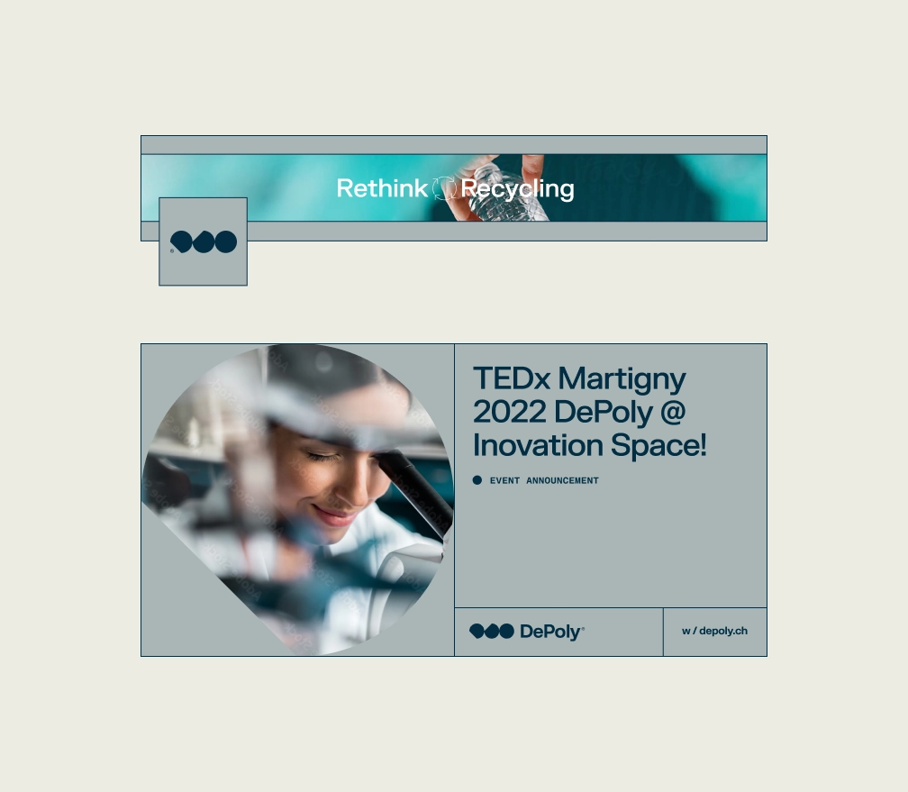
2022 Facebook Assets: (post template design, profile & cover image)
2022 Twitter Assets: (post template design, profile & cover image)
2022 LinkedIn Assets: (post template design, profile & cover image)
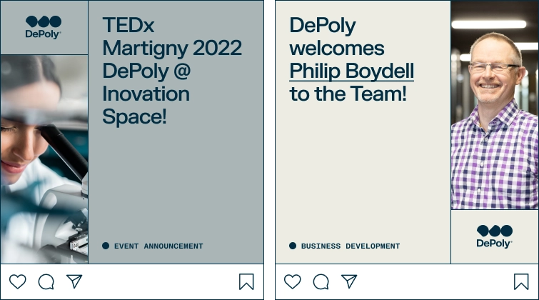
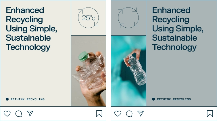
Instagram 2022
DePoly’s instagram layout utilizes the icons we’ve mentioned previously as story badges.
Once integrated with the brand guidelines, they make for very effective messaging as they can be arranged to expand through different levels of the page layout.
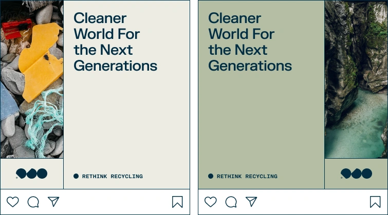
Instagram posts using DePoly’s branding language grid system
Instagram posts using DePoly’s branding language grid system
Instagram posts using DePoly’s branding language grid system
Visual Content
- 3D Visualization
- Storyboard
- Graphic design
- Video & Motion
Clean, dignified, and distinguishable: recycling reimagined by capturing the reclaimed potential of plastics.
Challenge
In terms of storytelling, the content we created for DePoly was the main event of the visual narrative.
It had to express DePoly’s brand character while offering a wide range of visual vocabulary to be used as building blocks for introducing their technology.
It also had to remain consistent with the clean aesthetic of the client’s brand and technology, while still giving the impression of something “recycled,” so as to clearly state that we’re still talking about their industry.
Direction
Versatility in visual expression comes with a lower resolution of perception.
In aesthetic terms, that translates to: simple, smooth, clean, and monochrome.
This way, we could tie together the opposite connotations of “recycled” and “pristine” in a single breath, while maintaining enough expressive range to tell the story of transformation and explain DePoly’s technology.
In other words, our main theme was: recaptured potential, or recycled, if you will.
Result
To achieve the pristine look of a newly-formed product, we used simple, recognizable 3D models with clean, uniform textures to carry the visual narrative.
We made the branding color palette into a gradient (as shown below), complementing the textures and adding a natural, organic feel to the models.
Since the visual elements themselves were intentionally toned-down, the dynamics of the narrative were left to composition and lighting. The outcome: gradient monochrome, not monotone.
The future of recycling in polymer polygons: 3D Visual ASSETS
These 3D assets define DePoly’s visual narrative. As such, they had to be designed to fully embody the message, the character and the aesthetic of the brand, bringing all the other elements together to form a singular, clear visual expression with eloquence in composition.
Each one of these assets speak to different aspects of the client’s approach, value, and technology, and correspond with a clean aesthetic, uniformity of color, and simplicity of form.
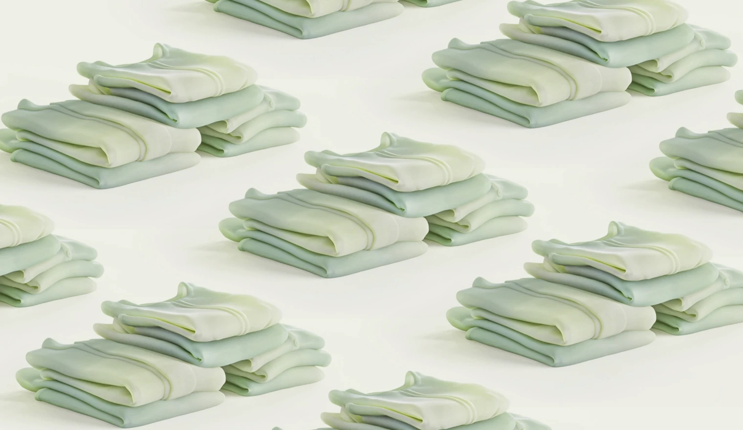
-plant-seo-optimization-fiftyseve-design-studio.webp)
Less than 10% of all post-consumer plastic waste can be recycled with traditional methods: the rest is burned or buried. DePoly’s enhanced recycling solves that problem.
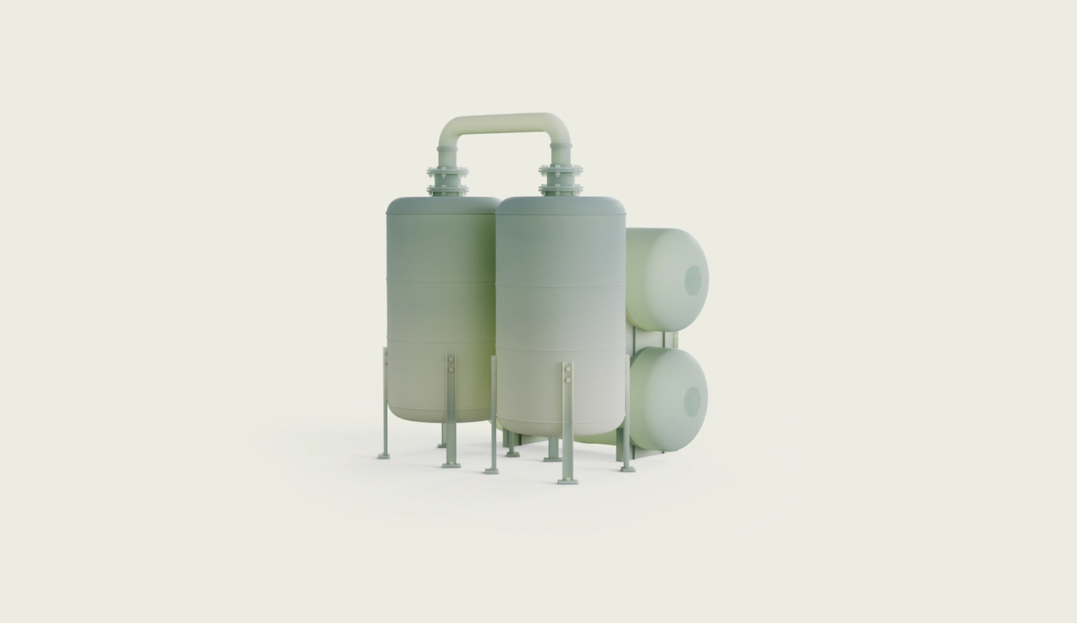
DePoly’s enhanced recycling process can recycle all PET plastic items. These items are simply collected and chemically recycled back into raw monomers, no separation or treatment required.

PTA and MEG are the raw materials used to make PET plastic in the first place. DePoly's technology makes them from PET plastic waste instead of from oil, closing the loop in the PET plastic value chain, creating a truly circular economy.
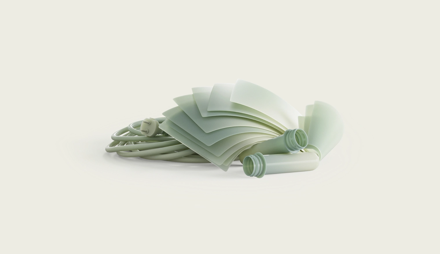
The PTA and MEG plastics produced by DePoly have the same quality and purity as their fossil sourced counterparts. This allows the plastics industry to make virgin quality PET plastic items from DePoly branded recycled PTA and MEG.
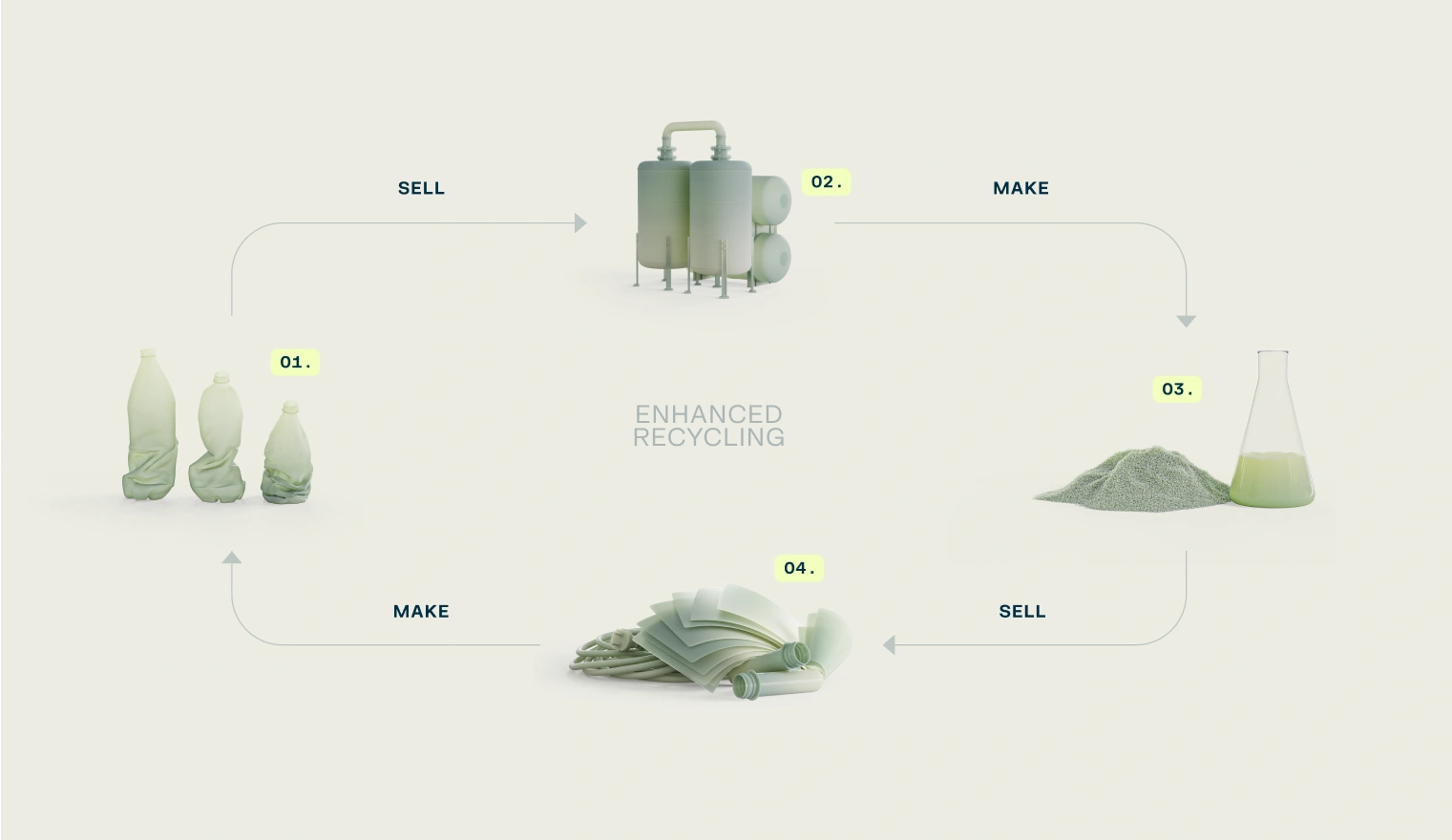
A process of PROCESSING PLASTICS: Depoly’s approach
This is a depiction of DePoly’s technology with an emphasis on the clean, cyclical nature of their approach through color and texture.
Used, disposable plastic products are funneled into DePoly’s enhanced recycling process and break down into PTA granules and MEG liquid. In that original, pristine state, they’re ready to be used as base ingredients to form new plastic products.
Thanks to well defined art direction, we managed to turn the nuanced story of enhanced recycling into an interactive visual experience that’s easily graspable without any prior knowledge of recycling processes or technology.
Plastic, paper, and textilE: all at once
This 3D visualization shows the deconstruction process of the three base materials DePoly’s technology is suited for.
Their positioning, showing them as layered on top of each other, denotes that they don’t need to be pre-sorted or pre-washed before they can enter the recycling process.
A FLUID Dynamic: PTA & MEG processing
PTA and MGA are the two basic components integral to the production of plastic products. This image captures the moment when they either separate or come together in the recycling process, hinting that they are different aspects of a singular form.
a proprietary portrait: depoly’s technology
Due to the proprietary nature of the technology involved in DePoly’s recycling process, we had to resort to abstraction in order to depict it.
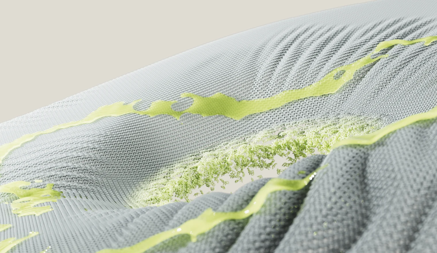
This composition shows the fabric as the medium of separation between MGA liquid and PTA powder, where the fabric serves as a stand-in for the DePoly’s new technology, an obvious analogy with a suitable texture.
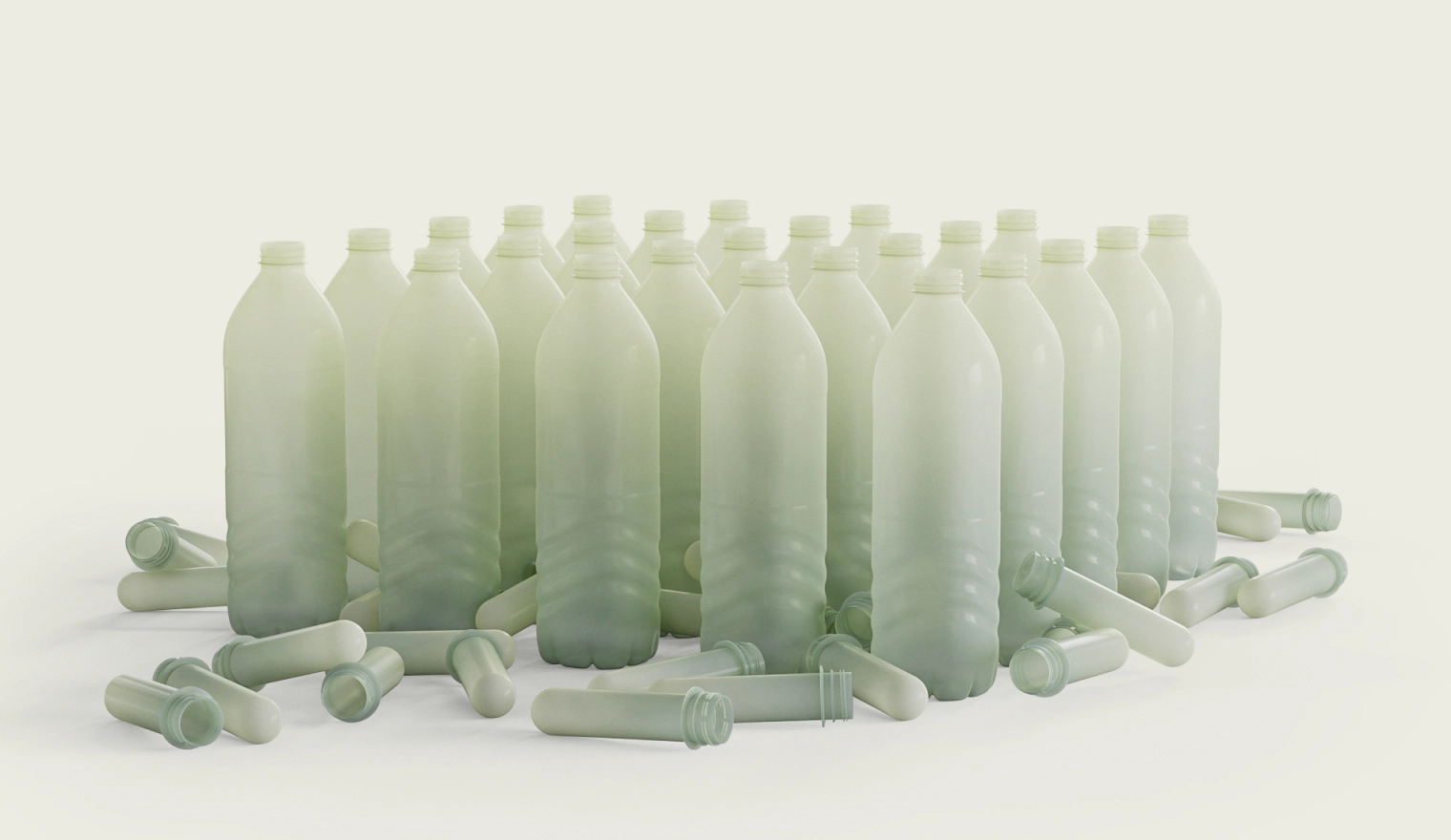
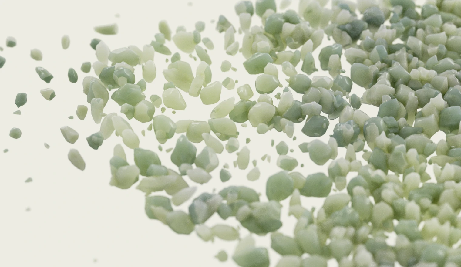
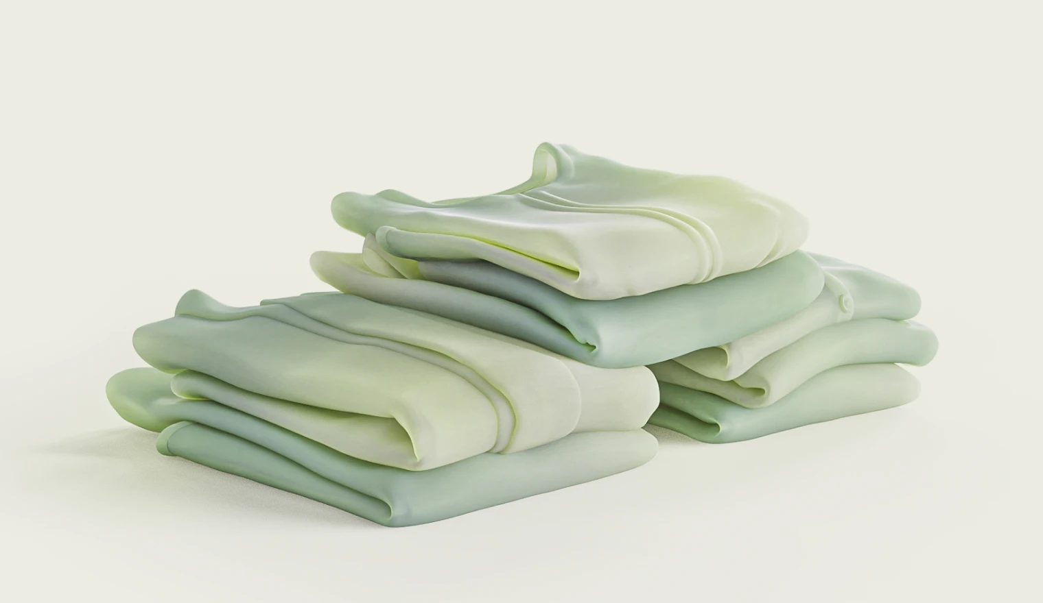
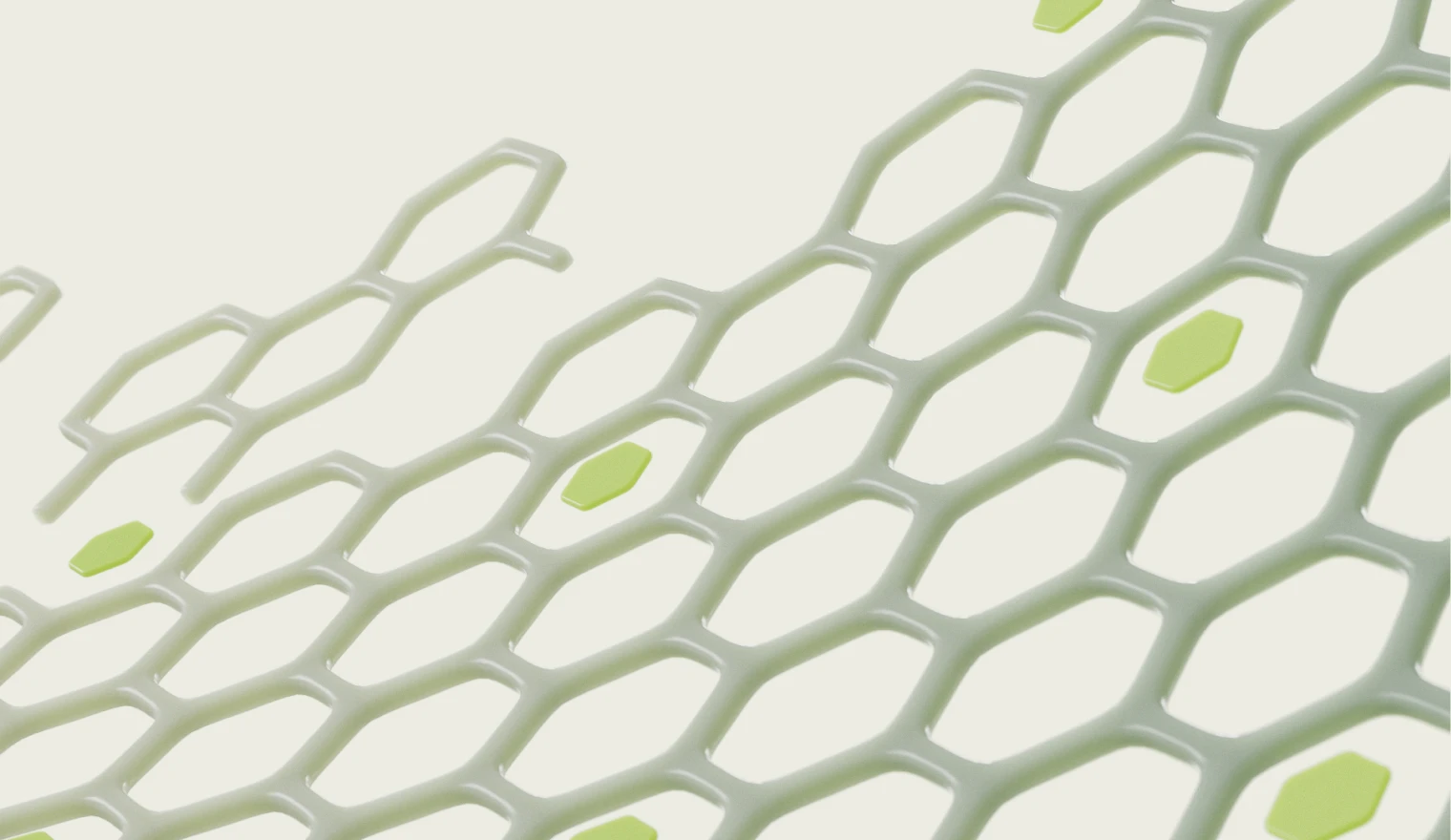
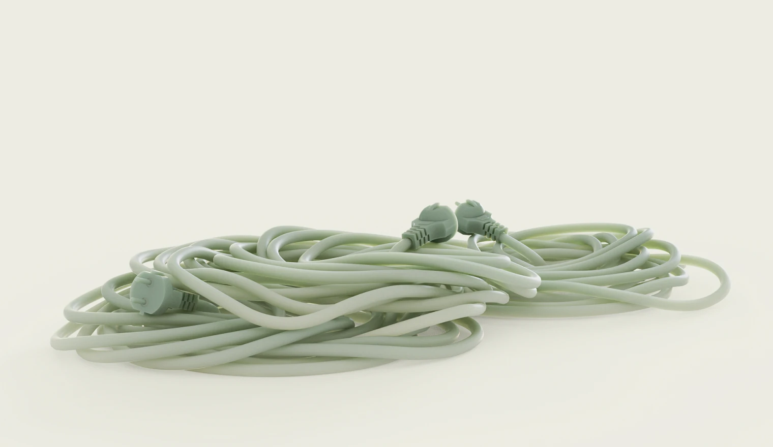

A visualization of the constructive / deconstructive potential of DePoly’s technology,
showing PTA granulates transforming into plastic products and vice versa.
A visualization of the, PET is referred to as ‘polyester’. Its good stability and mechanical
resistance, and cost make it attractive compared to natural fibers or other synthetic fibers.
PET sheets and films are used in packaging and electronics. PET sheets are thermoformed into trays (for example boxes
of chocolate). PET film has a unique ability to be stretched in two dimensions, and is usually sold as ‘BOPET’
Website
- Web UX
- Web UI
- Editorial
- Interactions
- Animations
A story of contrast, in context: a web experience designed to complete the cycle of DePoly’s enhanced tech.
Challenge
By this point, our visual assets were already doing all the heavy lifting that they could to express brand character and explain technology. That left composition and motion as the last remaining storytelling tools at our disposal.
The challenge was crafting a cohesive, non-linear experience with a narrative arc that’s easy to follow.
It had to cover the impact of current recycling practices and ease the user into DePoly’s approach. Establishing trust in the brand as a scientific authority, the narrative had to make the main CTA, contacting DePoly, a natural next step.
Direction
Since the problem and solution contrasts in the story were apparent, we set out to make them work in our favor.
The experience had to flow, so we decided to juxtapose the journey of plastic waste with the current pollution problem in the recycling industry, contrasting it with DePoly’s enhanced recycling solution through the lens specific to a given page.
We would then educate the user, explaining the technology, the problem, and the opportunity DePoly offered. This would make contacting DePoly to request sample a natural conclusion at any given point on the website.
Result
Our approach centered around keeping the message clear and the story linear, while cyclically adding more context as the user progresses through the pages.
Each page covers a unique aspect of DePoly’s approach to a problem and its solution, presented through a comprehensive narrative experience with fluidity of motion and a clean aesthetic.
In tandem with the previously mentioned contrast, this approach gradually establishes DePoly’s credibility and makes the Sample Request Form the perfect CTA at any given point, accessible from anywhere on the website.
Depoly and the problems with plastics: HOME
The landing page embodies the core narrative structure of DePoly’s message. It uses interactive animations to lead the user through the recycling landscape, highlighting the contrast between the problem (linear recycling) and its solution - DePoly’s enhanced recycling technology.
The undertone of negative environmental impact is integrated into the narrative on landing page, branching out into sections that educate the user as they progress. This balances out DePoly’s approach, keeping the user engaged until they arrive at the main CTA (the sample request form).
As the contrast between the general problem and current, inadequate solution becomes apparent, we present the DePoly’s technology as a natural conclusion: a definite solution to the problems of contemporary recycling.
depoly’s method goes mobile
Having in mind DePoly’s unique desktop layout, we made sure the mobile experience matches it fully.
The visual narrative follows the same beats, establishing a clear story arc that flows from problem to solution, firmly establishing DePoly’s brand aesthetic and fully utilizing the visual assets to express ensure the message they convey both engaging and comprehensive.
Request the results, reexamine recycling: request sample form
As the main CTA, the sample request form serves as the bridge between potential investors and DePoly. It is a direct means of establishing credibility by allowing licensed laboratories to verify the quality of the new technology themselves by testing the samples DePoly provides.
The “request sample” button is unobtrusive, but clearly visible in the upper right corner of every page and the form itself is extremely responsive and comes in and out from the side with a single click.
This way, filling out the form doesn’t interrupt the experience, and allows the user to get back to the content without losing their place on the page.
full-circle recycling: Depoly’s technology
DePoly’s technological process was presented with the same problem-solution dynamic as seen on the Home Page.
Starting wide with the abstraction of DePoly’s technological process, the narrative flows through the sections of the page, elaborating on its impact, the technology and process behind DePoly’s enhanced recycling.
Due to the art style and linear progression, the flow is interrupted only by taglines to the right of the visual, with each emphasizing a specific aspect of the technology or expanding on its impact, as well as its real-life applications.
At the bottom, the narrative comes full circle with the main CTA: the clearly designated sample request button.
Enhanced recycling explained on the go
Keeping in mind that DePoly’s Technology page was a challenge in its desktop form, the mobile version of the page received special care when it came to applying the same approach to storytelling: engagement, successfully carrying the full experience of the desktop page into the mobile format.
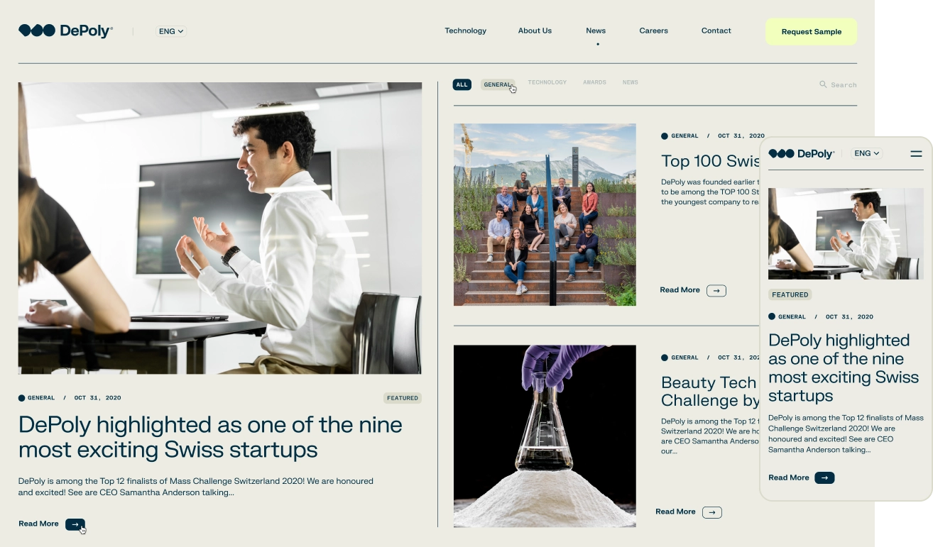
Depoly’s progress in digital print: NEWS page
Inspired by the hands-on nature of DePoly’s CTA, the news page was designed to further the feeling of authenticity and immediacy by capturing the look and feel of a traditional, printed publication.
The layout of the content itself doesn’t deviate from the DePoly’s character, but does provide a different, more intimate approach to engaging with the brand.
About page: The people of depoly
As we got to know our clients, we couldn’t deny the fact that there was a youthful, free spirit associated with the character of their diverse team.
We decided to bring that spirit to the forefront on the About page and provide an insight into the humanity behind DePoly’s technology.
First, presented DePoly’s diverse team as a whole, by the numbers, showcasing their unique team stricture.
Then, in the sliding menu for individual bios and credentials, we added a section were we asked them to provide some insight into who they are outside of work.
Since everybody liked the idea, we spontaneously ended up with a page that truly speaks to who DePoly are, both as a team and as individuals.
taking the path of pta progress: Depoly careers
DePoly (climate tech) is a fast growing company, so the Careers page was of particular importance.
We decided to make it as familiar and welcoming to potential applicants as possible, paying special attention to typography and streamlined design.
We also included testimonials as a brief insight into the employees’ experience at DePoly, emphasizing the approachable character of the company and giving the prospective hires a clearer picture of who they’ll be working with.
However, the main focus was ease of use and clarity of navigation through the vacant positions list, including the layout for the job descriptions.
Finally, we included a CTA for job applicants, providing them with an application form and a file upload option for supporting documents.
- We gave them complete creative control, and they understood exactly what we wanted./DePoly SA, CEO & Co-Founder
Sam Anderson
CEO & CO-FOUNDER
Outcome
Since we’ve launched DePoly’s brand and website, they’ve successfully increased brand recognition and organic views across all platforms, gathering enough funding to allow them to build their first, scaled, demonstration recycling plant, inaugurated in July 2026.
All outcomes are reported by the Client through a post-project feedback session
$30M+
+102%
+130%
+30%
+34%
76%
- Client:DePoly SA
- Timeline:4 Months
- Awards:
- Sector:
- Industry:Climatetechnology
- Country:Switzerland
- Services:Competitive AnalysisCreative DirectionArt DirectionBrand IdentityBrand Tone & VoiceBrand ApplicationDesign SystemPhotography Art DirectionPitch Deck DesignGraphic Design3D VisualizationVideo & MotionWeb UX DesignWeb UI DesignCreative DevelopmentContent Management System